Best Blue Wallpapers for iPhone
Picking blue wallpapers for iPhone, from deep navy and ocean tones to bright sky blue, with clock contrast tips, gradients, and AI generation advice.
Blue is the safe, smart default — the color most people reach for when they want a wallpaper that simply looks good and stays out of the way. It is calming, it suits almost any home screen, and it spans a huge range from near-black navy to bright cyan. That range is exactly why it pays to be deliberate about which blue you choose and how you frame it. Here is a practical guide.
The blue family and what each end does
Blue covers more ground than almost any other color, and the shade sets the whole feel:
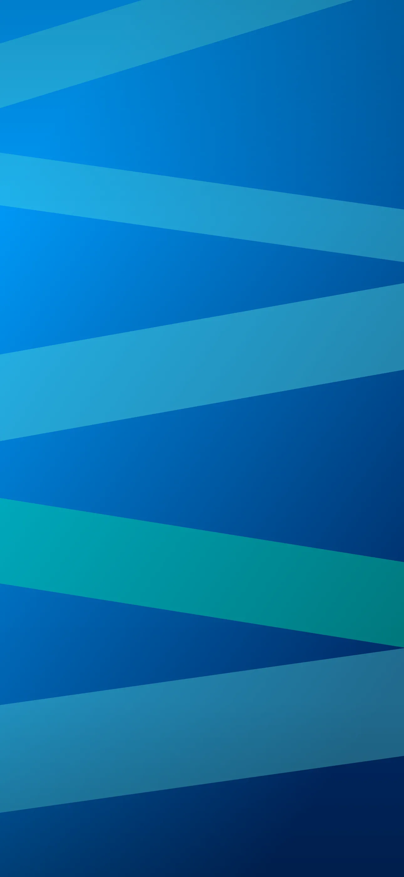
- Navy and midnight — deep, near-black blues. Professional, OLED-friendly, easy on the clock.
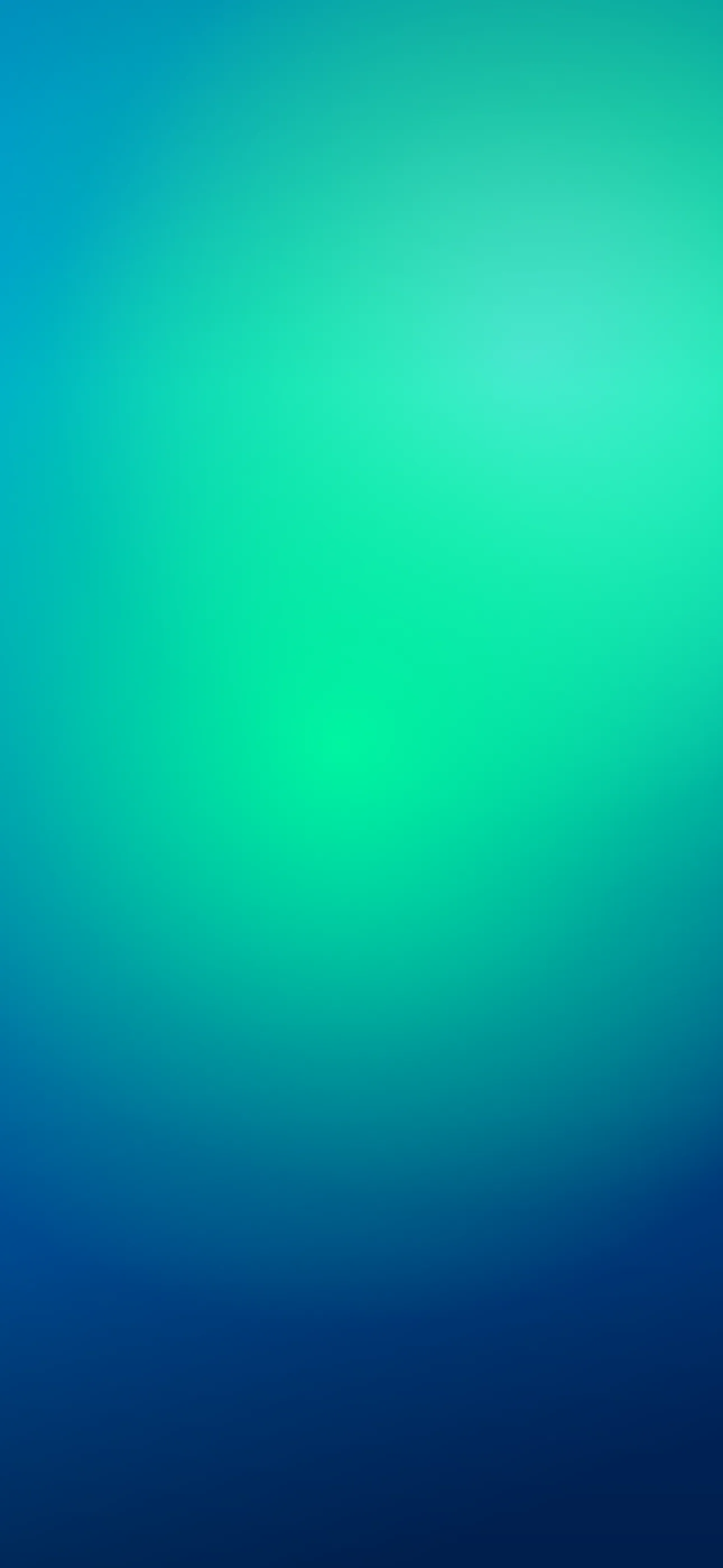
- Ocean and teal — blue-green tones that feel natural and fresh.
- Royal and cobalt — saturated mid-blues, confident and vivid.
- Sky and powder blue — pale, airy, calming, the light end of the family.
Navy and midnight blues are the most versatile for a lock screen because they behave like a dark wallpaper — clean clock contrast and a near-seamless screen — while still reading clearly as blue.
Why deep blue suits OLED and the clock
On OLED iPhones — the Pro models and the standard line from the iPhone 12 onward — very dark navy sits close to the panel’s off state. You do not get the full pure-black saving, but a midnight blue keeps the screen deep and seamless and lets brighter accents glow. Because most blues are mid-to-dark, iOS usually picks a light clock that reads beautifully against them. Pale sky blues are the exception: they are light enough to trigger a dark clock, so treat them like a light wallpaper and keep the top third even.
Composing around the clock and Dynamic Island
Keep the upper-middle third quiet — solid blue or a smooth gradient — so the clock has a consistent background. Push any focal element into the lower half: a bright moon, a wave crest, a single sail, a glowing horizon, sitting above the widget row and the flashlight and camera buttons. On a dark blue, the Dynamic Island blends in well. Set art at native resolution — 1290 x 2796 on the 6.7-inch and 6.9-inch models, up to 1320 x 2868 on the iPhone 17 Pro Max — so gradients stay smooth without banding.
Gradients and sub-styles
Blue is one of the best gradient colors there is:
- Blue-to-purple twilight — the classic deep, calming blend.
- Blue-to-teal ocean — fresh and natural, great with widgets.
- Deep sea to black — an OLED-friendly fade into pure black at the edges.
- Sky and cloud photography — real blues from dawn and daytime skies.
For literal water themes, the nature collection is a good source, and for flowing color fields the abstract style covers smooth blue blends.
Widgets, accents, and Depth Effect
Blue is one of the friendliest backdrops for widgets. Light clocks and glyphs read cleanly on the darker shades, and blue pairs naturally with white, gold, coral, and warm grey accents. If you tint your home-screen icons, a single cool tone keeps the whole setup coherent.
A bright subject on a clean dark-blue field is a strong Depth Effect candidate — a moon, a lighthouse light, a single bright object — which iOS can lift in front of the clock for a layered look. Subtle motion suits blue too: slow-rolling water or drifting clouds as a live wallpaper, played when you touch and hold the lock screen.
Making your own blue wallpaper
The AI generator does blue gradients and ocean scenes well. Name the exact shade — midnight navy, teal, cobalt, powder blue — and add pure black background for the OLED-friendly deep look. Prompts like deep navy ocean at night, single bright moon low in frame, fading to black, vertical or smooth cobalt to teal gradient, minimal, empty space at top, vertical are reliable. Generate a few, then use the editor to deepen the edges or shift the hue, and confirm the focal point clears the clock.
To set it: save the image, touch and hold the lock screen, tap the plus button, choose Photos, crop so any bright element sits below the time, and apply Depth Effect if iOS offers it. For more on cohesive setups, see how to set an aesthetic wallpaper.
FAQ
Is navy good for OLED iPhones? Yes. Very dark navy sits near the panel’s off state, giving a deep, seamless screen and a small battery benefit while still clearly reading as blue.
Why is blue an easy color for the clock? Most blues are mid-to-dark, so iOS picks a light clock that contrasts cleanly. Only pale sky blues trigger a dark clock instead.
Wallpapers from Wallpaper Hub
Full gallery