Best Pink Wallpapers for iPhone
Choosing pink wallpapers for iPhone, from soft blush to hot Y2K pink, with tips on clock contrast, widget pairing, and generating your own shade.
Pink is one of the most versatile colors you can put on a lock screen, because it spans such a wide range. A pale blush feels calm and grown-up; a saturated magenta feels playful and loud; a dusty rose lands somewhere quietly elegant in between. The trick is matching the shade to the mood you actually want, and composing it so the clock and widgets still work. Here is how to do that well.
The pink spectrum, and what each shade signals
Pink is less one color than a family, and the version you pick sets the whole tone:
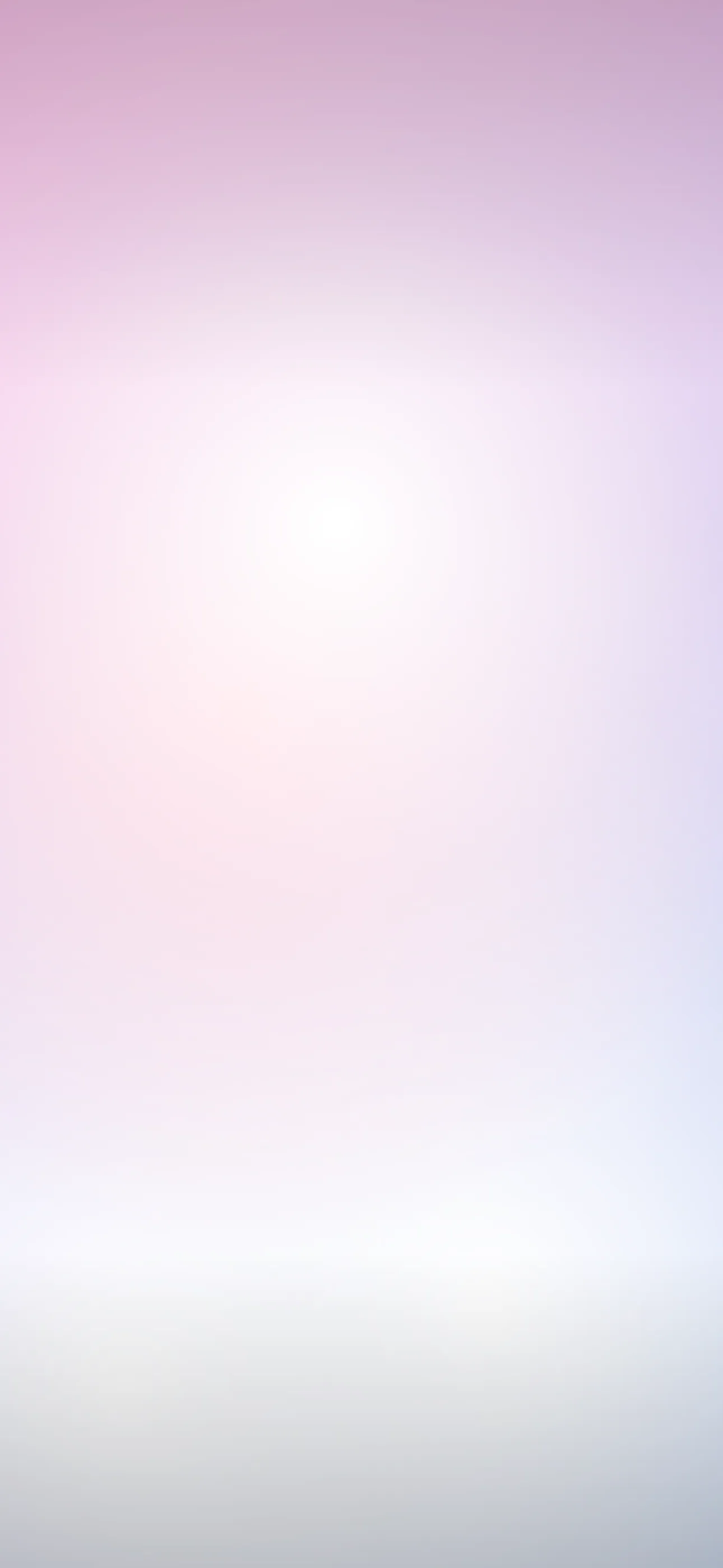
- Blush and baby pink — soft, pale, calming. Reads as minimalist and mature rather than girly.
- Dusty rose and mauve — desaturated and slightly grey, the most “design-forward” pink. Pairs beautifully with neutrals.
- Coral and salmon — pink leaning warm toward orange. Lively and summery without being loud.
- Hot pink and magenta — high-saturation, high-energy. The signature of Y2K aesthetics and bold statement screens.
A useful habit: decide whether you want calm or energy first, then choose the saturation to match. Pale pinks calm; hot pinks energize.
Composing around the clock and Dynamic Island
Pink behaves differently from black or white at the clock. Pale pinks are light enough that iOS usually picks a dark clock; deep magentas are dark enough that it picks a light one. The shades that cause trouble are the mid-tone pinks right on the boundary, where the auto-tint can flicker between the two and the time reads muddy.
The fix is the same regardless of shade: keep the upper-middle third even in tone — solid pink or a smooth gradient — so the clock has a consistent background to tint against. Push any focal element, sparkle, or darker accent into the lower half above the widget row. On the 6.7-inch and 6.9-inch panels that is 1290 x 2796, rising to 1320 x 2868 on the iPhone 17 Pro Max, so there is plenty of room below the time.
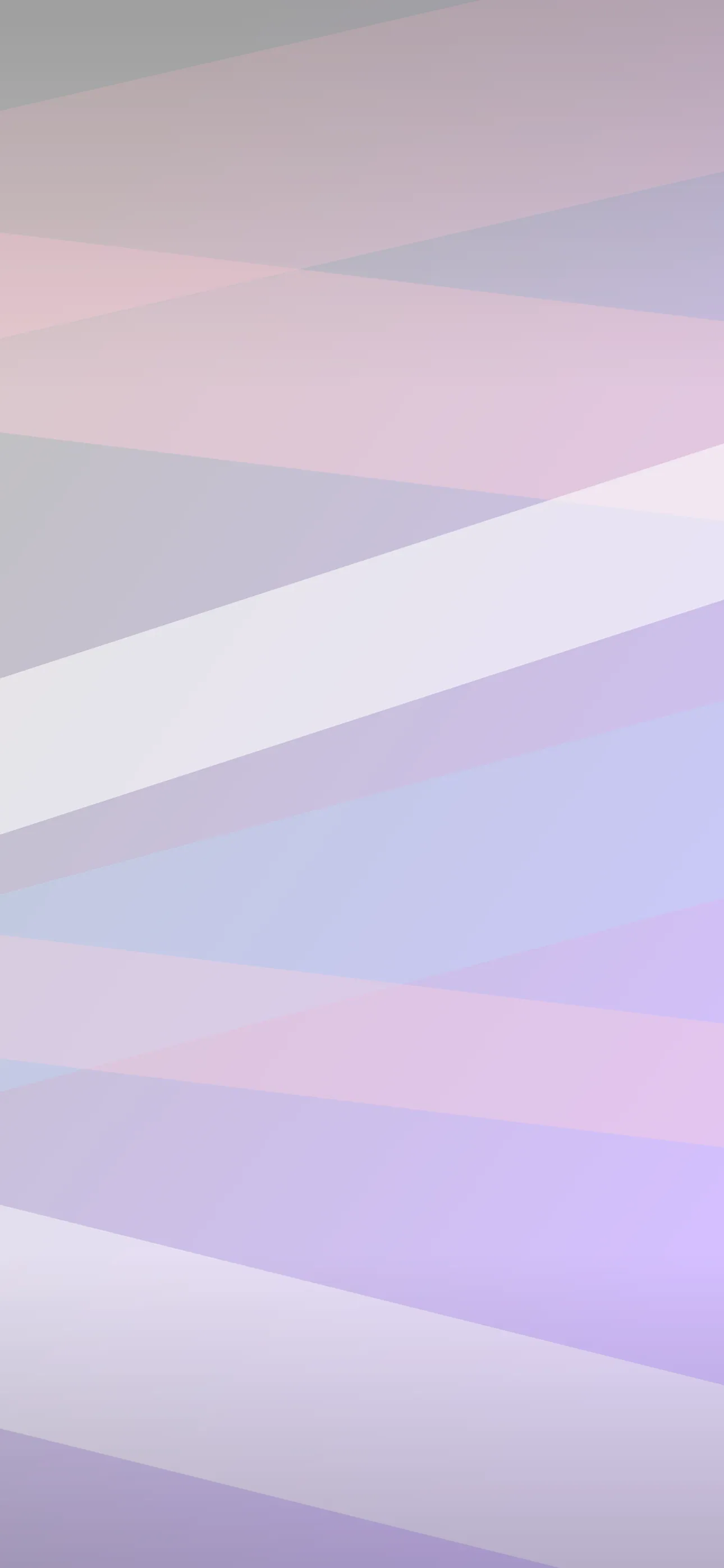
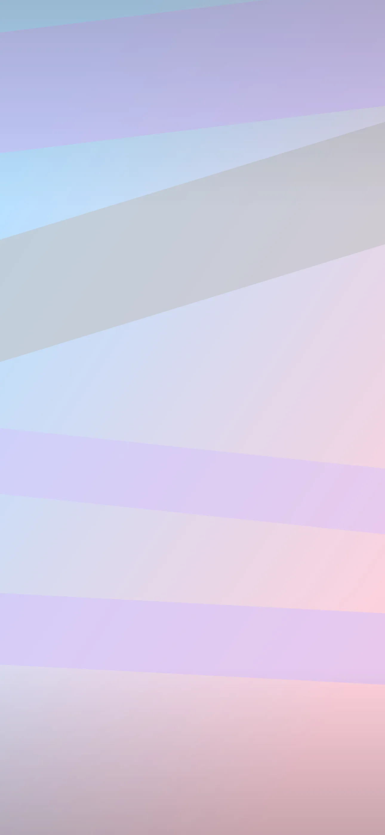
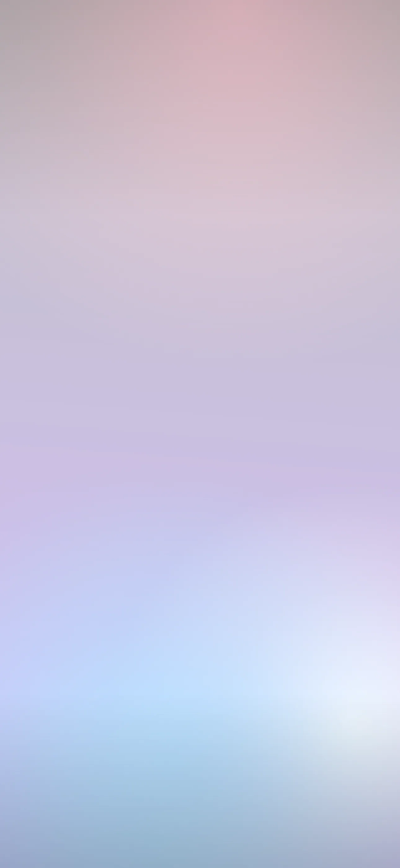
Gradients and sub-styles that work
Pink rewards a few specific treatments:
- Pink-to-peach or pink-to-lilac gradients — soft sunset-style blends that feel premium.
- Pink with chrome or holographic accents — the Y2K look, glossy and iridescent.
- Blush with a single line drawing — minimal florals or shapes on a pale field.
- Sky pinks — real sunset and dawn photography, where the pink comes from clouds.
Avoid stacking many bright pinks against competing colors; pink is forgiving on its own but quickly turns chaotic when crowded.
Widget and icon pairing
Pink sits well with a surprising range of accents. Pale blush pairs with cream, sage, or grey widgets for a calm scheme. Hot pink wants either a matching bold accent (cyan, lime, purple) for a Y2K palette or stark white to keep it from overwhelming the screen. If you tint your home-screen icons, pulling a single tone from the wallpaper into the icons ties the whole setup together.
Depth Effect and motion
A clear subject on a soft pink field — a single flower, a small object, a figure — can lift in front of the clock with Depth Effect for a layered look. The effect needs enough contrast between subject and background, so it works better on a clean pale pink than on a busy magenta scene. Subtle motion suits pink too: drifting petals, slow shimmer, or gentle gradient movement as a live wallpaper, played when you touch and hold the lock screen.
Making your own pink wallpaper
The AI generator is a fast way to dial in an exact shade, which matters more with pink than almost any other color. Name the specific pink — dusty rose, blush, hot magenta — rather than just “pink.” Prompts like soft blush pink gradient, smooth, empty space at top, minimal, vertical or Y2K hot pink and chrome, glossy holographic, bold, vertical tend to land. Generate a few, then use the editor to nudge the hue warmer or cooler and confirm the clock zone stays even.
To set it: save the image, touch and hold the lock screen, tap the plus button, choose Photos, crop so any subject sits below the time, and check the clock tint reads cleanly. For broader inspiration see the aesthetic wallpaper guide or how to make your iPhone aesthetic.
FAQ
Which pink looks most mature on a lock screen? Dusty rose and mauve — desaturated pinks read as design choices rather than novelty, and pair cleanly with neutral widgets.
Why does my clock look muddy on a pink wallpaper? Mid-tone pinks sit on the boundary of the light and dark auto-tint. Keep the top third an even tone so iOS commits to one clock color.
Wallpapers from Wallpaper Hub
Full gallery