Best Purple Wallpapers for iPhone
A guide to purple wallpapers for iPhone, from deep OLED violet to soft lavender, covering clock contrast, gradients, Depth Effect, and AI generation.
Purple is the color that flatters an iPhone screen almost no matter what you do with it. It carries a built-in sense of depth, it pairs naturally with the dark mode the rest of iOS leans into, and at its deepest end it gets you most of the benefits of a black wallpaper while still having character. This guide breaks down the purple family and how to compose it so the clock and widgets stay clean.
The purple range, from lavender to near-black violet
Purple covers a lot of ground, and where you land changes everything:
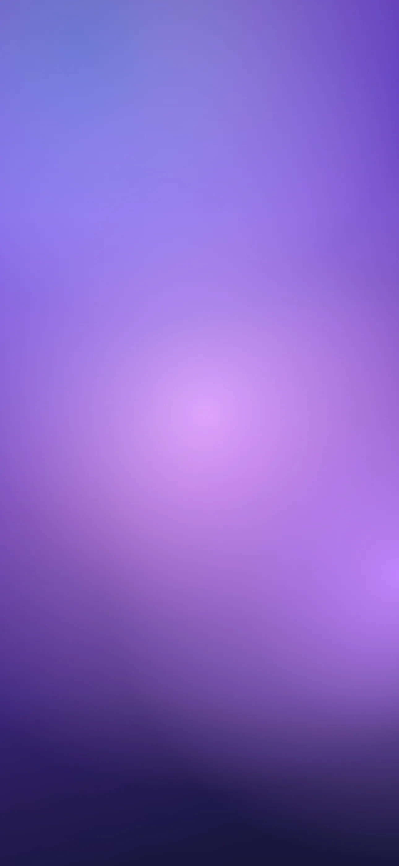
- Lavender and lilac — pale, soft, calming. The minimalist end of purple, easy on the eyes.
- Royal and violet — saturated mid-purples, rich and confident.
- Plum and aubergine — deep, slightly red-shifted purples that feel luxurious.
- Near-black violet — purple so dark it reads almost black, ideal for OLED.
The deep end is worth special attention, because it gives you the floating-bezel look and a touch of the battery benefit of black while staying warmer and more distinctive.
Why deep purple loves OLED
On every OLED iPhone — the Pro models and the standard line from the iPhone 12 on — very dark purples sit close to the off state of the panel. You do not get the full pure-black battery saving, but a near-black violet keeps the screen feeling deep and seamless, and it makes any brighter accent glow against it. If you like the dark aesthetic but find pure black a little cold, deep purple is the natural alternative.
Composing around the clock and Dynamic Island
Most purples are dark enough that iOS picks a light clock, which reads cleanly against them — one of the reasons purple is so forgiving. Lavender is the exception; it is light enough to trigger a dark clock, so treat pale purples more like a light wallpaper and keep the top third bright and even.
For deeper purples, the usual rule applies: keep any glowing focal element — a nebula highlight, a bright orb, an accent stroke — out of the clock zone and pushed into the lower half above the widget row. The Dynamic Island blends well into dark purple, nearly disappearing until an activity expands it. Set art at native resolution: 1290 x 2796 on the 6.7-inch and 6.9-inch models, up to 1320 x 2868 on the iPhone 17 Pro Max.
Gradients and sub-styles
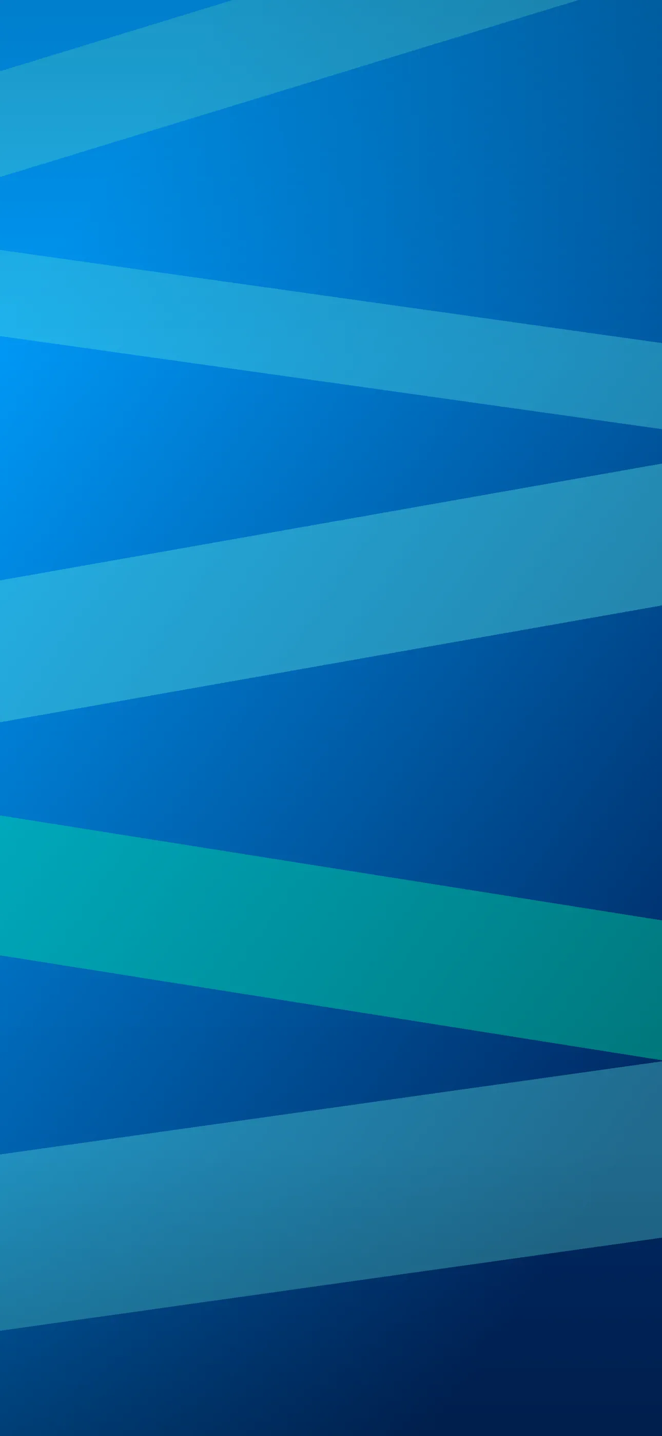
Purple is a gradient powerhouse. A few combinations that consistently look premium:
- Purple-to-blue — the classic twilight blend, calming and deep.
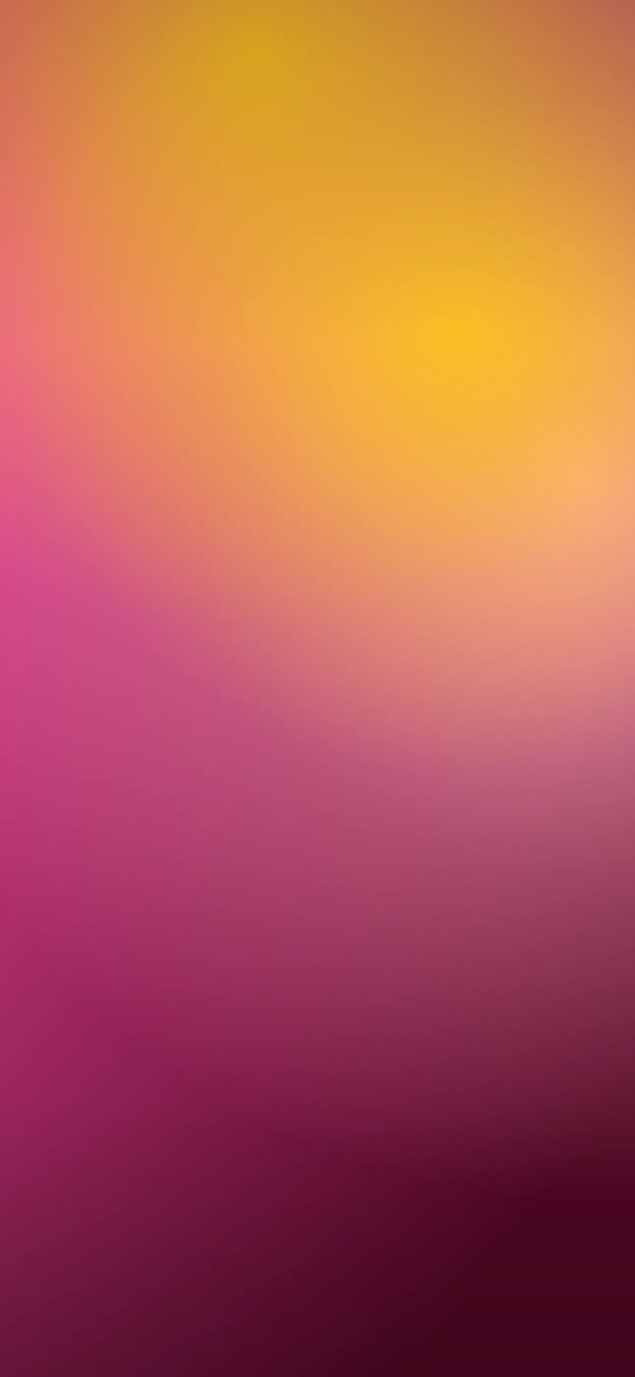
- Purple-to-pink — a warmer sunset-style gradient, vivid without being harsh.
- Aurora purples — soft bands of violet and teal, like northern lights.
- Cosmic and nebula — deep space scenes where purple does the heavy lifting against black.
For abstract, flowing takes on these, the abstract style collection is a good source of ideas.
Widgets, accents, and Depth Effect
Light clocks and glyphs read well on most purples, and widgets stay legible without fuss on the darker shades. For accents, purple pairs beautifully with gold, teal, soft pink, and cool grey; avoid muddy browns and oranges, which fight it.
A bright subject on a clean dark-purple field is a strong Depth Effect candidate — iOS lifts it in front of the clock for a layered 3D look, and the deep background makes the separation convincing. The Depth Effect picks show the look in practice.
Making your own purple wallpaper
The AI generator handles purple gradients and cosmic scenes well. Name the exact shade — lavender, royal violet, deep aubergine — and add pure black background if you want the OLED-friendly deep look. Prompts like deep violet nebula, scattered stars, near-black background, empty space at top, vertical or soft lavender to pink gradient, smooth, minimal, vertical are reliable. Generate a few, then use the editor to deepen the background or shift the hue, and confirm the focal point clears the clock.
To set it: save the image, touch and hold the lock screen, tap the plus button, choose Photos, crop so any bright element sits below the time, and apply Depth Effect if iOS offers it. For more on building a cohesive look, see what makes a good iPhone wallpaper.
FAQ
Is deep purple good for OLED iPhones? Yes. Very dark purples sit near the panel’s off state, giving a deep, seamless look and a small battery benefit while staying warmer than pure black.
What clock color does iOS use on purple? Most purples are dark enough for a light clock, which reads cleanly. Pale lavender triggers a dark clock instead, so treat it like a light wallpaper.
Wallpapers from Wallpaper Hub
Full gallery