Best Kawaii Wallpapers for iPhone
A guide to kawaii wallpapers for iPhone, covering pastel characters, soft motifs, and arranging cute designs around the clock with readable contrast.
Kawaii is the Japanese aesthetic of cuteness — soft pastels, rounded characters, big eyes, and a generally cheerful, gentle mood. It’s one of the most popular looks for phone wallpapers because it’s instantly comforting, and it’s flexible enough to range from minimalist to densely decorated. The main thing to get right on an iPhone is balance: kawaii loves to scatter cute little motifs everywhere, but the clock and widgets still need room. Here’s how to keep it adorable and usable.
What makes a wallpaper kawaii
Kawaii draws on a recognizable set of cute ingredients:
- Rounded characters — little blobs, animals, food with faces, and big-eyed mascots.
- Soft pastel palettes — pink, mint, lavender, butter yellow, baby blue.
- Gentle motifs — clouds, stars, hearts, bows, strawberries, mushrooms, rainbows.
- Squishy, simple shapes — thick outlines or no outlines, soft gradients, rounded corners.
- Sticker and grid layouts — repeating tiny icons, or one big central character.
You don’t need everything at once. One central mascot on a soft field, or a tidy grid of tiny icons, reads as cleaner and cuter than a chaotic pile.
Composing around the clock
Kawaii compositions tend to fill the frame with small scattered motifs, which is where iOS layout comes in. The clock sits in the upper-middle and the Dynamic Island notches the top. A busy cluster of stickers right behind the time makes it hard to read.
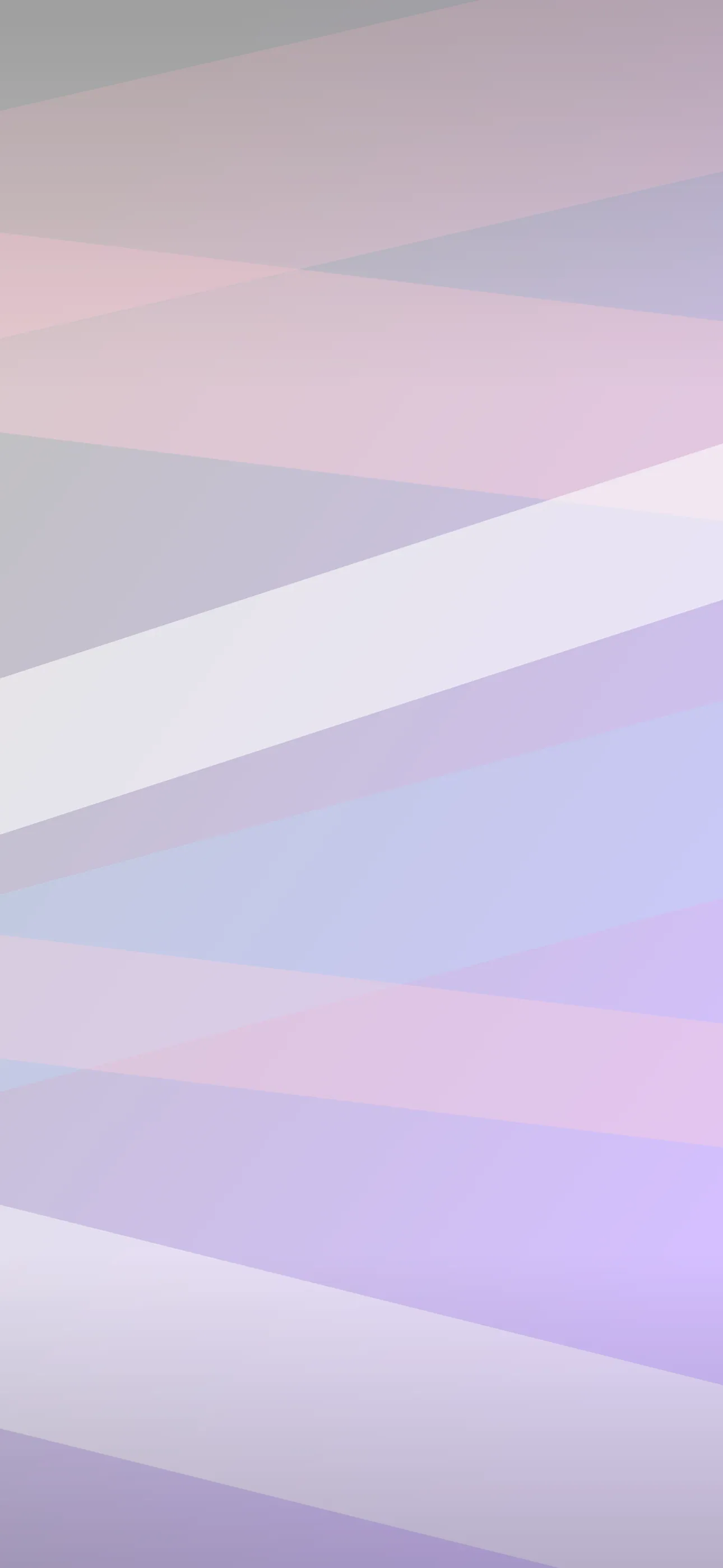
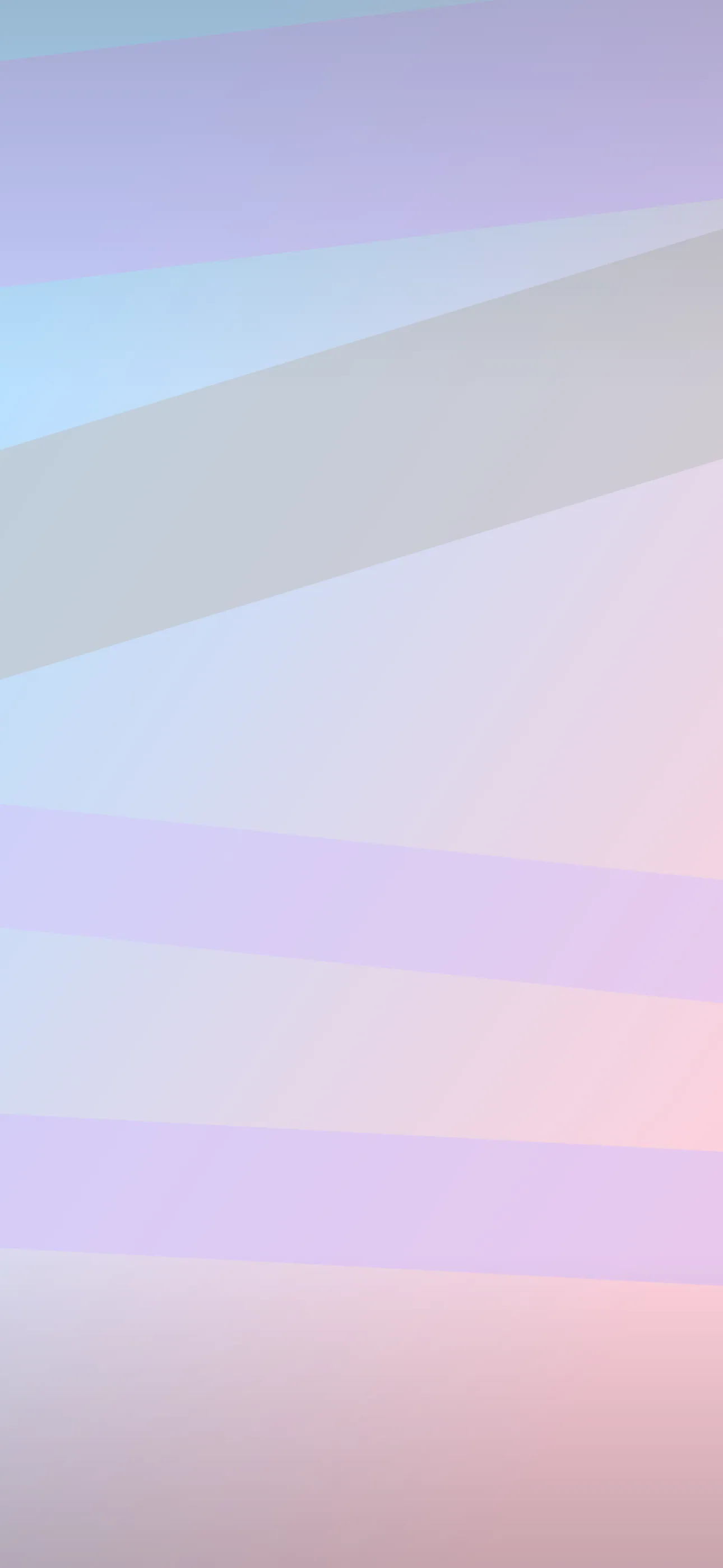
The cute-but-clean move is to keep the upper-middle calmer — a soft pastel patch, a stretch of sky, or open space — and let the characters and motifs cluster in the lower half near the widgets. Because kawaii is soft and low-contrast by nature, a quiet clock zone fits right in. A single mascot peeking up from the bottom is a classic, clock-friendly layout.
Palettes and widget contrast
Kawaii palettes are pastel and bright, which is gentle but can be tricky for white clock text:
- Pink and mint — the signature; keep contrast soft behind the time.
- Lavender and baby blue — dreamy and calm, easy on legibility.
- Butter yellow and peach — warm and cheerful; watch near-white patches behind the clock.
- Soft rainbow pastel — playful, but keep the busiest band lower.
Lock-screen widgets sit just under the clock, and over a pale, busy pattern their text can fade. Leave that band a touch simpler or slightly deeper in tone so icons stay readable.
Resolution and clean cuteness
Kawaii art relies on smooth shapes, clean outlines, and soft gradients — all of which suffer badly from upscaling. A small image stretched to fill the screen turns crisp characters into fuzzy blobs and introduces banding in pastel gradients. Aim for the native panel resolution — 1290x2796 on the current Pro Max — so the cuteness stays crisp.
Depth Effect with a single mascot
Depth Effect lets iOS lift a clear subject so the clock layers behind it. A single central character or mascot with a clean edge over a soft background is an ideal candidate, giving that fun 3D layered look where the character pokes in front of the time. All-over sticker grids usually won’t trigger it because there’s no single subject. So if you want the effect, build around one hero character in the lower-to-middle frame. The Depth Effect guide covers the details.
Light by nature, not OLED
Kawaii is mostly bright and pastel, so it isn’t a natural fit for OLED battery tricks, which rely on true-black backgrounds. That’s fine — cuteness is about soft and cheerful, not dark. If you do want an efficient variant, a dark-mode kawaii look with a glowing mascot on near-black is a sweet exception that also saves a little power.
How to set or generate a kawaii wallpaper
Cute graphics are everywhere online but often low-res or watermarked. A curated, iPhone-framed library avoids the muddy upscales. In Wallpaper Hub the anime and minimalist collections overlap with the kawaii mood, with tools to make your own:
- Use the AI generator for a one-of-one — try “kawaii pastel mascot, big eyes, mint and pink, soft clouds, calm area at top” or “cute tiny food characters grid, butter yellow background.”
- Open the editor to soften the clock zone, recolor a palette, or place a single mascot below the time.
- Keep a bright pastel version and a dark-mode mascot version for variety.
For setup, see How to Set an Aesthetic Wallpaper and the cute aesthetic guide.
FAQ
How do I keep my clock readable over a busy cute pattern? Pick or edit a version with a calmer pastel patch in the upper-middle and let the characters and stickers cluster lower near the widgets.
Can kawaii wallpapers use Depth Effect? Yes, if there’s a single central mascot with a clear edge. iOS can lift it so the clock layers behind, but all-over sticker grids usually won’t trigger the effect.
Wallpapers from Wallpaper Hub
Full gallery