Best Lofi Wallpapers for iPhone
A guide to the lofi wallpaper look for iPhone, covering muted palettes, grainy textures, cozy scenes, and how to frame them around the clock and widgets.
Lofi is a feeling before it’s a look. It borrows the warmth of lo-fi music — slightly imperfect, unhurried, a little nostalgic — and turns it into wallpaper. Think soft grain, hazy light, and quiet rooms where nothing is in a rush. This guide breaks down what actually makes a lofi wallpaper read as lofi on a phone, and how to frame one so it stays calm behind the clock and widgets.
What defines the lofi look
Lofi wallpapers are less about a single subject and more about treatment. Several traits show up again and again:
- Muted, desaturated color — nothing is fully bright; tones feel washed and gentle.
- Visible grain or film texture — a subtle noise that makes the image feel analog rather than crisp digital.
- Warm, low-contrast light — lamp glow, late-afternoon sun through a window, or the cool blue of evening.
- Cozy, lived-in scenes — a desk, a windowsill, a rainy street, a quiet bedroom.
The mood is introspective and slow. If a scene feels like it could loop forever without anything happening, it’s probably lofi.
Palettes and sub-styles
Lofi splits into a few recognizable moods, each with its own palette:
- Warm study — amber, cream, soft brown. Desk lamps, books, a cup of coffee.
- Rainy window — muted teal, grey, dim blue. Streaks on glass and blurred city lights.
- Sunset haze — dusty pink, peach, lavender. Gradient skies with a grainy overlay.
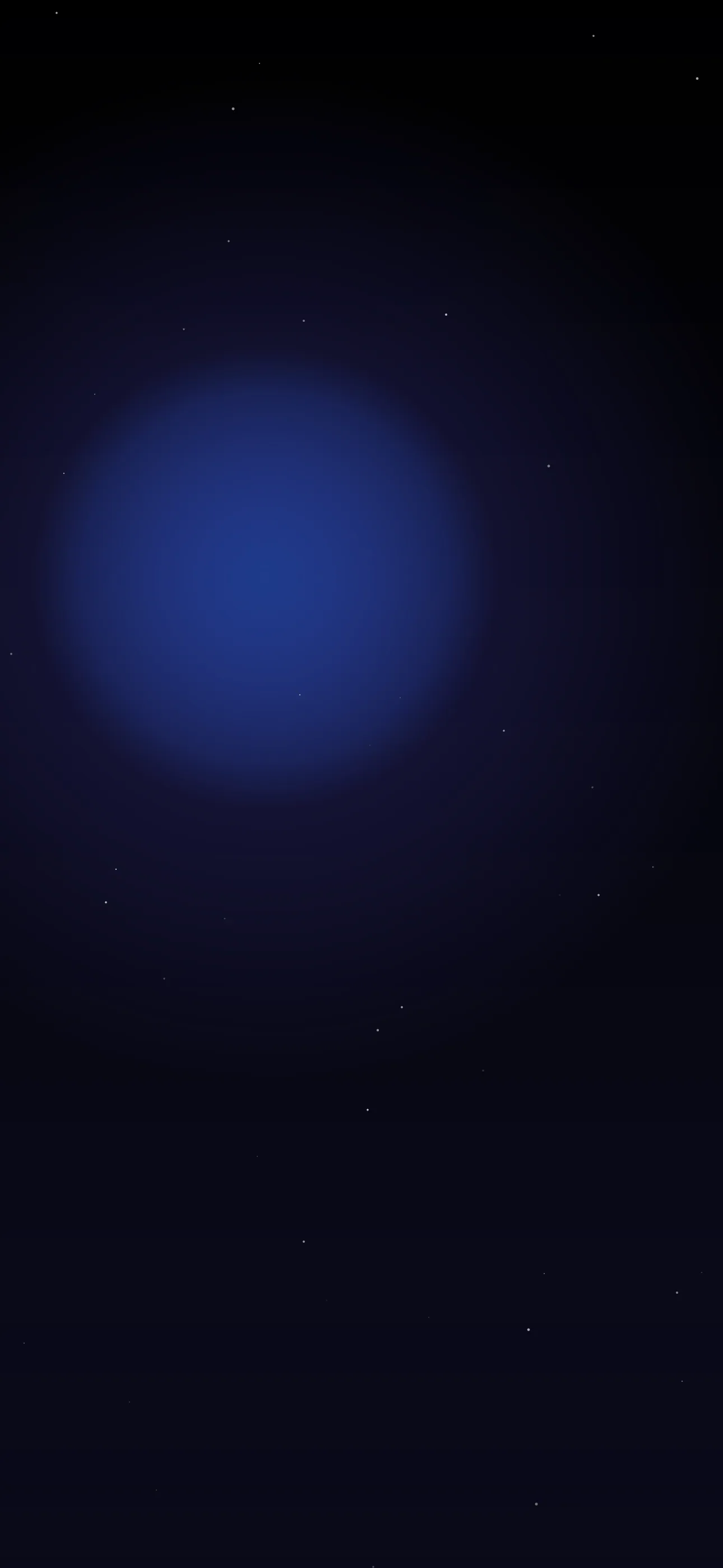
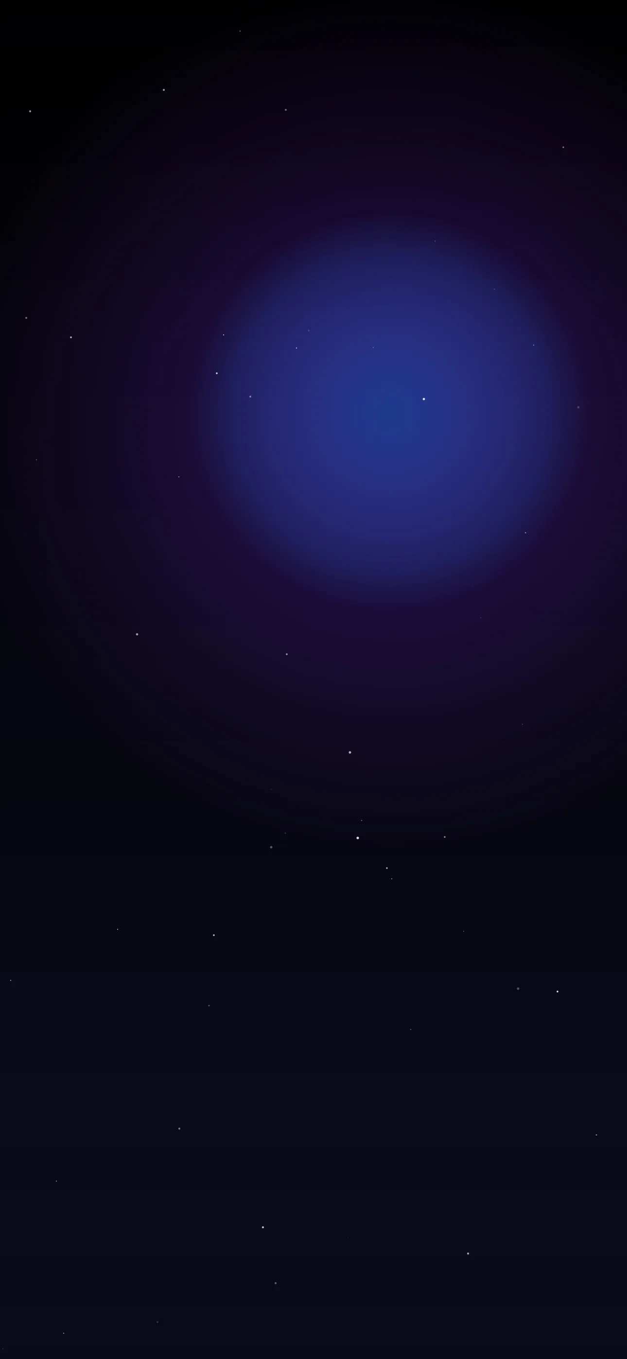
- Night city — deep navy and neon-but-dimmed signage, more glow than glare.
Because lofi leans dark and muted, it suits OLED screens on iPhone 14 Pro and later, where true-black pixels switch off and deep night scenes look especially clean.
Composition around the clock
The lofi aesthetic is forgiving here, because the look is already soft and low-contrast. Still, a few rules keep things readable:
- Keep the busiest detail in the lower two-thirds so the clock and Dynamic Island sit over a calmer area.
- A hazy sky, blurred window, or out-of-focus wall behind the time reads beautifully.
- Grain can interfere with crisp white clock text if it’s too heavy up top — fade it slightly in that zone.
Widget contrast
Lofi’s muted tones can make widgets blend in. Pick a palette with one consistent value range — all warm mid-tones, or all cool darks — so the frosted widget panels keep a steady contrast. If text starts to vanish, a slightly darker version of the same scene fixes it without changing the mood.
Resolution and Depth Effect
Lofi is one place where you don’t want to over-sharpen, but you still want native resolution. Render or export at 1290x2796 for current Pro Max models, up to 1320x2868 on the largest screens, so grain stays fine and intentional rather than blocky. Saved-from-the-web lofi images are often small and get muddy when iOS upscales them.
Depth Effect works when there’s a clear foreground object — a mug, a plant, a window frame — with a soft background behind it. A flat, all-over grainy scene usually won’t trigger the layered look, so if you want the clock to tuck behind something, choose a composition with one defined object low in the frame.
Adding gentle motion
Lofi is built for subtle live wallpaper motion — rain drifting down a window, steam curling off a cup, a slow flicker of warm light. The key is restraint. A loop so slow you almost don’t notice it matches the genre far better than anything energetic.
How to set or AI-generate
Saved lofi art tends to be low-res or cropped wrong for a tall screen. A curated library skips that. In Wallpaper Hub the broader styles and dark collections hold cozy, muted scenes already framed for iPhone:
- Use the AI generator for a one-of-one. Prompts like “cozy study desk at night, warm lamp glow, soft film grain, muted browns” or “rainy window overlooking blurred city lights, teal and grey, hazy” land the mood well.
- Open the editor to add grain, lower saturation, or darken the top so the clock stays sharp.
- Keep one warm daytime version and one dim night version for day/night Focus modes.
Get Wallpaper Hub on the App Store
For more on dialing in a soft, aesthetic look, see How to Set an Aesthetic Wallpaper and the wider best aesthetic wallpapers roundup.
FAQ
Q: Does lofi mean low resolution? A: No. The “lo-fi” feel comes from grain, muted color, and soft light — not from a small file. Always export at native iPhone resolution so the grain looks intentional, not pixelated.
Q: Will a grainy wallpaper look bad on OLED? A: Not at all. Dark, muted lofi scenes actually shine on OLED, where true blacks switch the pixels off and the warm highlights stand out more.
Quick checklist
- Muted color, soft grain, warm or cool low-contrast light
- Calmer area behind the clock, grain eased up top
- One defined object low in frame if you want Depth Effect
- Native resolution so grain stays fine, not blocky
Wallpapers from Wallpaper Hub
Full gallery