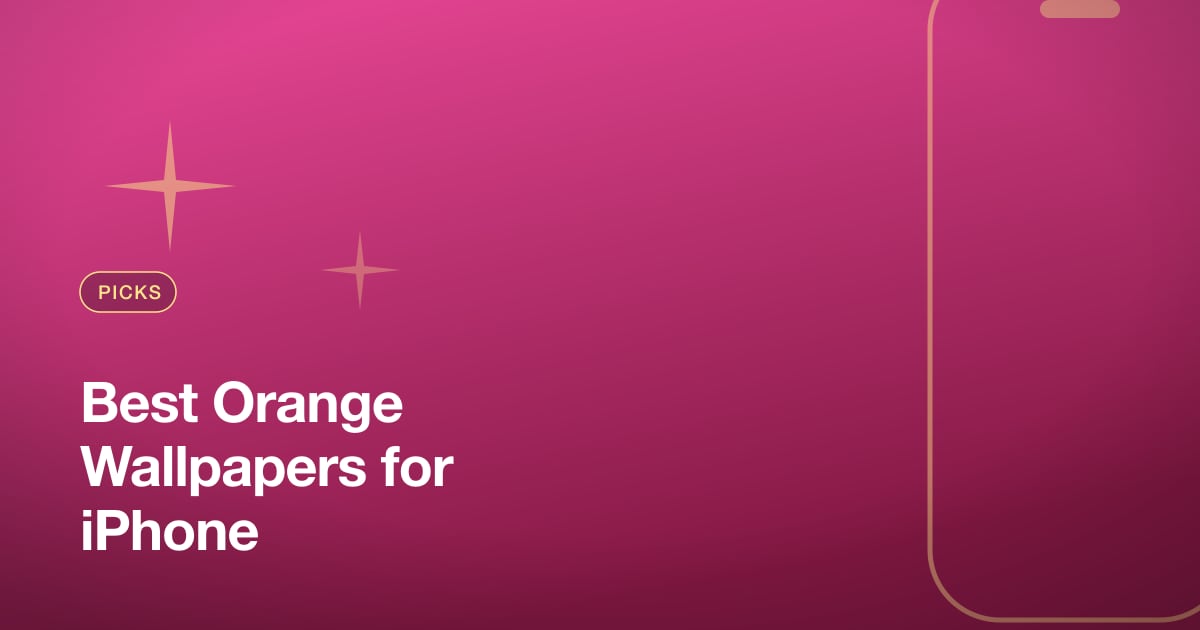
Best Orange Wallpapers for iPhone
A guide to orange iPhone wallpapers from burnt terracotta to bright tangerine, with tips on clock contrast, widget pairing, Depth Effect, and OLED suitability.
Orange is one of the most energetic colors you can put on a lock screen, and it ranges further than people expect — from soft, dusty terracotta to electric, saturated tangerine. It can feel warm and earthy or loud and modern depending on the tone you choose. Apple even leaned into the hue with the Cosmic Orange finish on recent Pro models. This guide covers how to pick an orange that pops without overwhelming the clock and widgets.
The range of orange
The word covers a wide span, and the tone you pick sets the whole mood:
- Burnt orange and terracotta — muted, earthy, slightly red. Cozy and grounded, great for autumn and boho palettes.
- Amber and honey — warm golden oranges that feel rich without shouting.
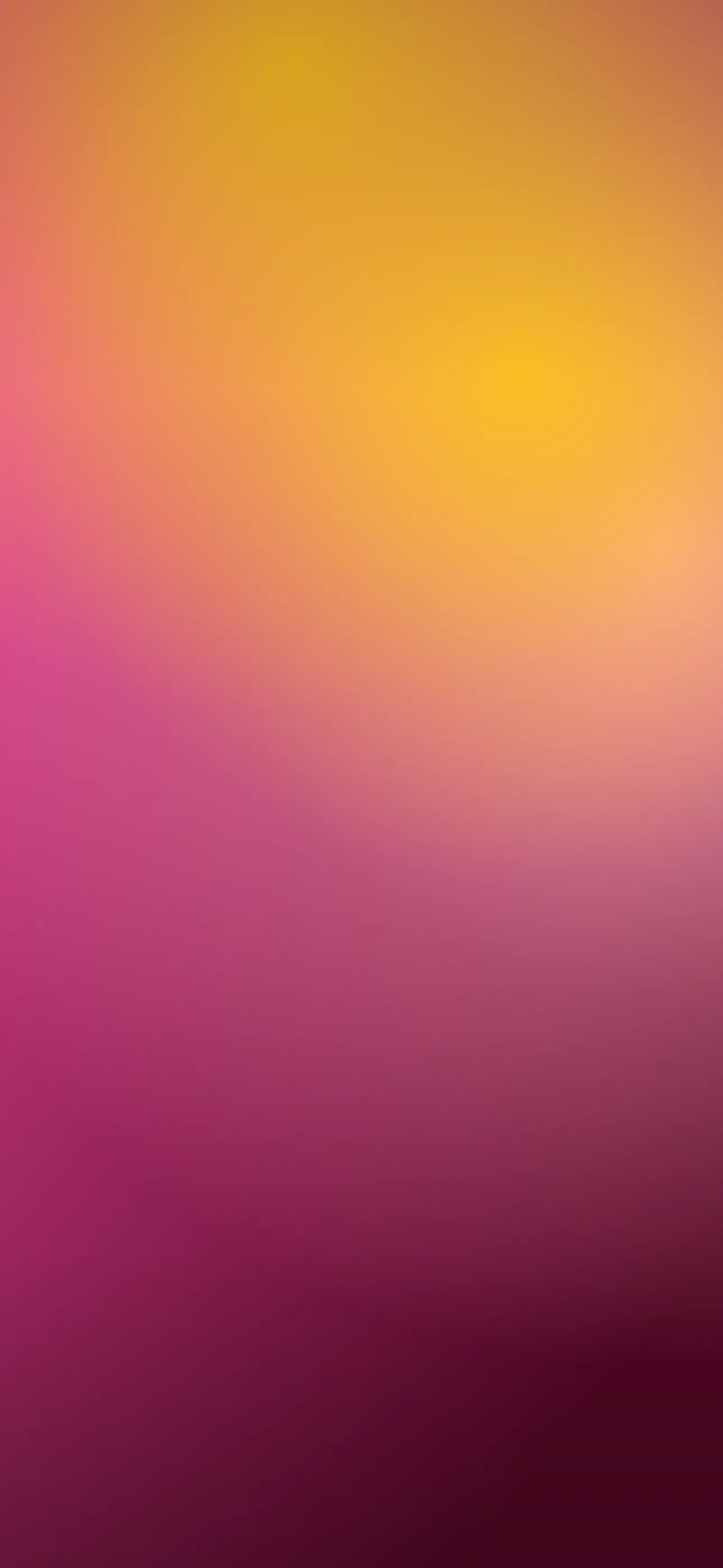
- Tangerine and bright orange — high-saturation, energetic, modern.
- Coral and peach — softer, pinker oranges that lean aesthetic and calm.
- Sunset orange — real or illustrated skies blending orange into pink and purple.
Earthy oranges suit a relaxed, organic look; bright oranges suit a bold, graphic one.
Palettes and motifs
Orange rarely works best alone — it’s anchored by what surrounds it. Strong combinations include:
- Orange + cream or beige for a warm, retro feel.
- Orange + deep brown for a 70s, earthy palette.
- Orange + charcoal or black for a punchy, high-contrast modern look.
- Orange + teal for a complementary, vivid pairing.
Common motifs are gradients, sunset skies, abstract blobs and waves, grainy retro textures, and bold geometric shapes. The graphic, high-energy versions overlap with the abstract look.
Composition around the clock and Dynamic Island
Bright orange is a strong field, so contrast is rarely the problem — readability usually comes down to placement:
- iOS auto-adjusts the clock, but a busy gradient that shifts from light to dark right behind the numerals can look messy. Keep the upper-middle relatively even.
- Around the Dynamic Island, a solid or smoothly graded orange looks clean; a high-detail texture there competes with the pill.
- For sunset oranges, position the brightest band away from the clock so it doesn’t blow out the text.
Widgets and home screen pairing
Orange is vivid, so widgets need a light touch. Tinted widgets in a deeper rust or a neutral cream keep things cohesive, while clear widgets let the color show. Avoid stacking many full-color app widgets on a bright orange ground — it gets noisy fast. A calmer home screen with a darker or more muted orange base balances a punchy lock screen.
Resolution and banding
Smooth orange gradients are prone to banding, and warm hues show it clearly. On a Pro Max panel at 1290x2796, a low-quality or upscaled source will reveal stair-stepping in the blend. Use a clean, full-resolution image and avoid heavy compression, which mottles flat warm fields.
Depth Effect with orange scenes
A flat orange wash or gradient won’t trigger Depth Effect — there’s no subject to isolate. But an orange scene with one clear element — a silhouette against a sunset, a single fruit, a bold shape in the lower frame — can layer behind the clock for a 3D feel. Choose a composition with a defined foreground subject rather than an all-over blend. The What is the Depth Effect? guide explains what qualifies.
OLED and orange
Bright orange is an all-on look and won’t save battery the way a true-black wallpaper does. If you want a darker companion, a deep burnt orange or rust on a near-black ground reads moody and rich while staying warm. Those deep tones render cleanly on the OLED panels in every iPhone 14 Pro and later. If you have a recent Pro in Cosmic Orange, an orange-accented dark wallpaper can echo the finish nicely — see Cosmic Orange Wallpapers.
How to set or AI-generate an orange wallpaper
In Wallpaper Hub you can browse orange gradients, sunsets, and abstract compositions framed for iPhone, or build your own:
- Try the AI generator with prompts like “burnt orange and cream retro gradient, grainy texture, warm” or “tangerine abstract waves, bold, smooth, slightly even at top.”
- Use the editor to even out the clock zone or shift a bright orange toward a calmer terracotta.
- Keep a bright daytime orange and a deep rust version for evening.
For more bold, graphic options, browse the Abstract collection, and for setup help see How to Set an Aesthetic Wallpaper.
FAQ
Will a bright orange wallpaper make my clock hard to read? Rarely, because orange is a strong field. The bigger risk is a busy gradient behind the numerals — keep the area around the clock relatively even.
Does orange save battery on OLED? No. Bright orange lights most pixels. A deep rust on a near-black ground is a better choice if you want a darker, power-friendlier look.
Wallpapers from Wallpaper Hub
Full gallery