Best Abstract Wallpapers for iPhone
Five abstract wallpapers for iPhone, from a clean classic composition to live motion, AI one-of-ones, and deep-black OLED picks that frame the clock.
Abstract is the rare aesthetic that never tells you what to think. There’s no character, no landmark, no season — just shape, color, and light arranged to feel like something. That openness is exactly why it works so well on a lock screen: with no literal subject competing for attention, your eye settles, and the clock and Dynamic Island sit cleanly on top instead of crashing into a face or a horizon line. This guide breaks down what actually makes an abstract wallpaper great on an iPhone, and how to find or build one that fits your phone instead of fighting it.
The sub-styles worth knowing
“Abstract” covers a wide range of looks, and they behave very differently behind iOS widgets. A few that hold up especially well on a phone:
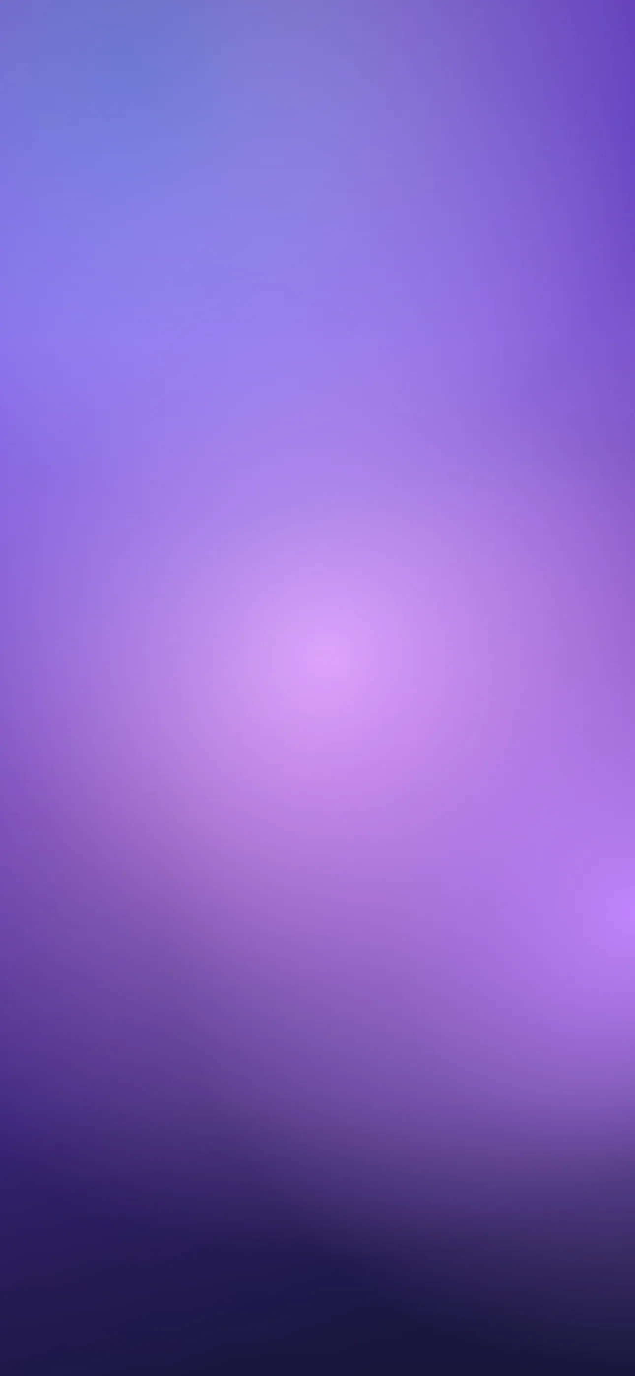
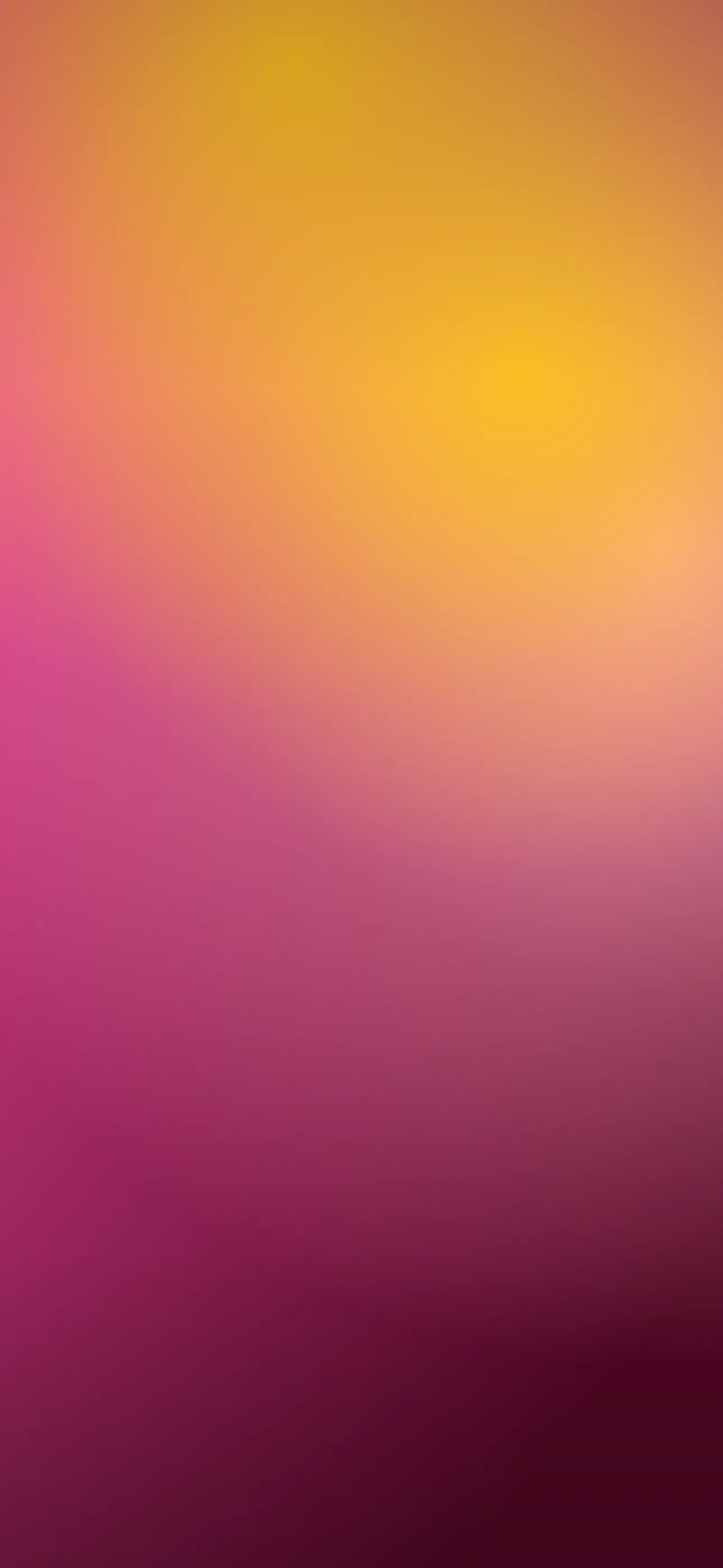
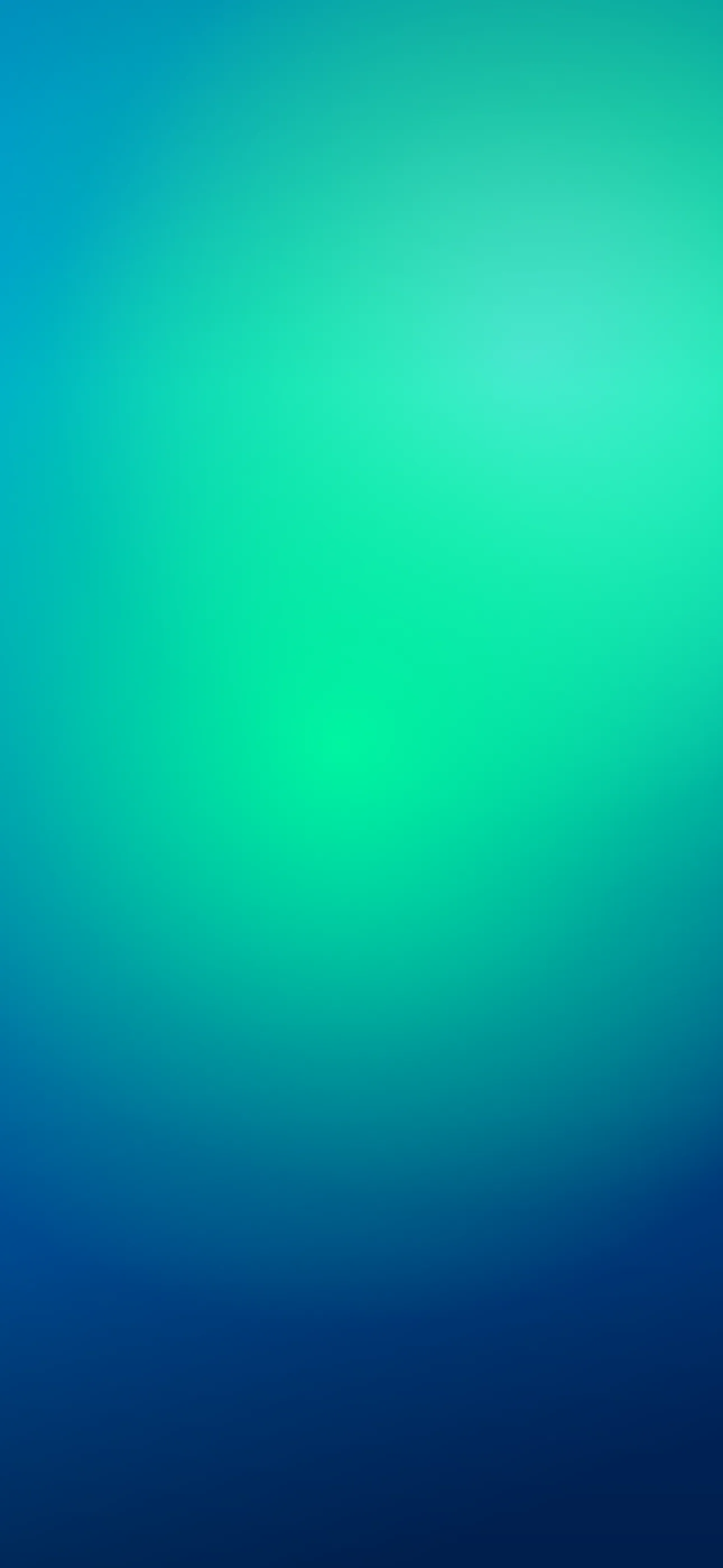
- Flowing gradients and liquid forms. Smooth blends of two or three hues — sunset coral into violet, teal into deep navy — with soft, marbled transitions. These are the most lock-screen-friendly because large calm areas give the clock room to breathe.
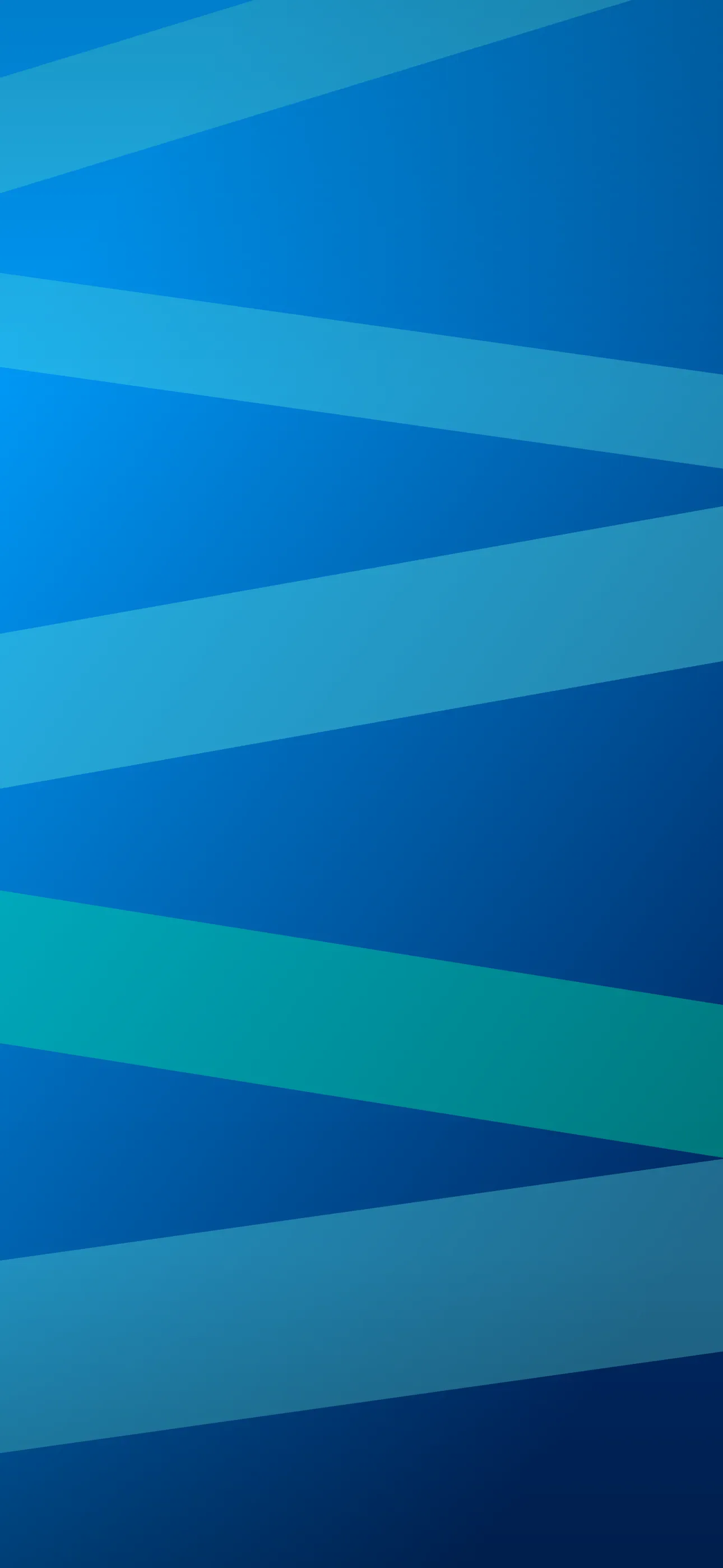
- Geometric and Bauhaus-inspired. Hard edges, circles, and intersecting planes in a tight palette. Striking, but you have to keep the upper third quiet or the time digits land on a busy seam.
- Fluid art and paint pours. Cells, veins, and metallic ribbons. High detail, so they read best when the composition pools toward the bottom and leaves the top open.
- Generative and fractal patterns. Math-driven swirls and noise fields. Beautiful at full resolution, easy to ruin with upscaling — render quality matters more here than anywhere else.
- Grainy risograph and textured prints. Muted retro tones with visible grain. They feel warm and analog and pair nicely with a single small widget.
What makes one work on the lock screen
The single biggest factor is where the energy sits. iOS stacks the time across the upper-middle of the screen, with the date and optional widgets just above it and the flashlight and camera buttons pinned to the bottom corners. An abstract wallpaper that crowds detail into that center band looks cluttered the moment you light up the display. The ones that sing keep their most intricate passage low or off to one side, leaving a softer, lower-contrast zone where the clock falls.
Contrast is the second factor. White iOS time digits need a mid-to-dark tone behind them; a pale pastel gradient will swallow the clock unless the wallpaper tint feature kicks in. If you love light palettes, look for compositions with a darker gradient stop near the top.
Resolution is the unglamorous third. A current iPhone lock screen is 1290 x 2796 on the 6.7-inch Pro and Plus models, and abstract art is unforgiving about stretching — soft gradients band, and geometric edges turn fuzzy. Always set art at native size.
Palettes that age well
Abstract lives and dies on color. Analogous palettes (neighbors on the color wheel — blue, teal, green) feel calm and cohesive. Complementary pairs (orange and blue, purple and yellow) feel energetic but can clash with colorful app icons on the Home Screen, so they’re often better reserved for the lock screen only. Muted, desaturated tones tend to look more expensive and last longer before they tire you out than neon. If you want something you won’t swap in a week, start there.
Depth Effect and motion
Pure abstract gradients usually don’t trigger iOS Depth Effect, because there’s no clear foreground subject for the system to lift in front of the clock. Compositions with a distinct floating object — a sphere, a ribbon, a blob with clean edges over a flat ground — are the ones that can produce that layered 3D overlap introduced in iOS 16. If the layered look matters to you, browse with that in mind, or lean into Depth Effect picks built for it.
Motion is where abstract shines. Drifting particles, slowly breathing gradients, and rolling liquid loops feel premium without being distracting, since there’s no narrative to interrupt. iOS plays these when you touch and hold the lock screen. If you want that, live wallpapers are the cleanest way to add subtle movement to an abstract scene.
Finding or making your own
You can browse a curated abstract collection in Wallpaper Hub, where each piece is composed at native iPhone resolution with the clock zone kept clear — including live versions for the motion styles above. If nothing fits the exact mood you’re after, the AI generator is genuinely useful here, because abstract is the one category where AI doesn’t have to get a recognizable subject “right.” Prompts like soft liquid gradient, deep teal to plum, grainy texture, dark top give you a true one-of-one. The built-in editor then lets you nudge crop, blur, and tint so the clock lands where you want it.
To set one: save the image, open Settings → Wallpaper → Add New Wallpaper (or touch and hold the lock screen and tap +), pick Photos, position it, and use the depth or tint controls if they appear.
Get Wallpaper Hub on the App Store
For more, browse the full wallpaper library or read What is the Depth Effect on iPhone?.
Abstract wallpapers in the app
All abstract