Best Emo Wallpapers for iPhone
A guide to emo wallpapers for iPhone, from moody black aesthetics to grunge textures and lyric text, with tips on OLED contrast, layout, and making your own.
Emo wallpapers are all about mood — dark, dramatic, a little melancholy, with a soft spot for grunge textures, heavy black, splashes of red or purple, and the occasional lyric in distressed type. Done right, an emo lock screen feels like a whole vibe the moment your screen lights up. Done wrong, it’s a muddy, low-contrast mess where you can’t read the time. This guide covers what defines the emo aesthetic, how to keep it moody without losing legibility, and how to make one that’s genuinely yours.
What gives emo its look
The aesthetic pulls from a few recognizable elements:
- Heavy black and shadow — deep, low-key frames where darkness is the point.
- Grunge and texture — scratches, grain, distress, torn edges, a worn film feel.
- Moody accent color — a bruised purple, blood red, or cold blue cutting through the black.
- Distressed typography — a lyric or short phrase in a rough, hand-drawn, or glitchy font.
- Melancholy imagery — rain, dim rooms, blurred lights, lonely silhouettes.
The thread that ties it together is atmosphere. Emo isn’t just “dark” — it’s emotional and textured, with intent behind the gloom.
Black, OLED, and keeping it from going muddy
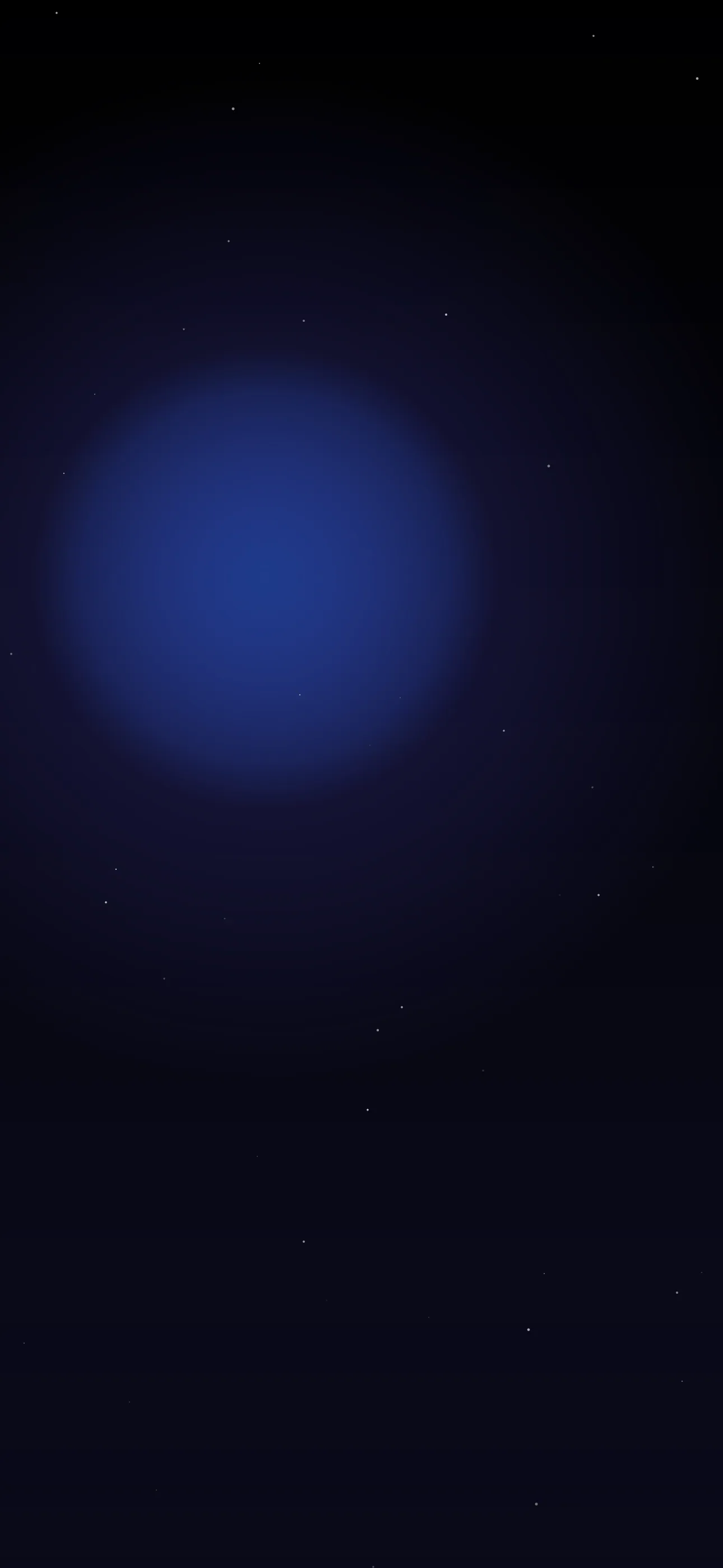
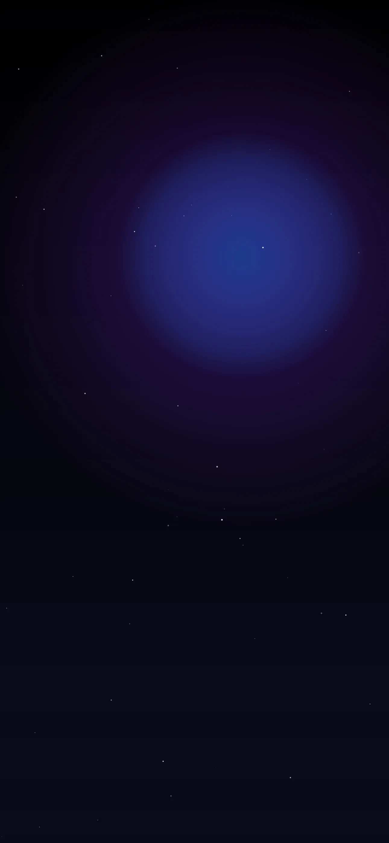
Black is the foundation of the emo look, and iPhones are built for it. Every Pro since the 14, plus recent base models, uses an OLED panel where pure-black pixels switch off entirely — so a true #000000 background looks borderless in a dark room and even sips slightly less battery. The dark library is the natural home for this.
The danger with all-dark wallpapers is that everything blends into a single murky blob. Avoid that by keeping one area of contrast — a single accent color, a pool of light, a sharp edge — so the frame has depth instead of reading as a flat black void. That contrast is also what keeps the clock and your widgets legible.
If you use lyric or text overlays
A line of lyrics or a short moody phrase is core to the emo aesthetic — but it still has to be readable:
- Keep it short. A few words or a single line. A full verse becomes unreadable clutter.
- Distressed, not illegible. Grunge and glitch fonts look great until they’re so rough you can’t read them. Pick texture that still resolves at a glance.
- Contrast against the dark. Light or red text on black reads well; make sure the accent color is bright enough to separate from the background.
- Keep wording generic or personal. A short original line or a plain phrase avoids the copied-image look and dodges lyric attribution issues.
Composing around the clock and Dynamic Island
iOS puts the large clock in the upper-middle third, the Dynamic Island into the very top, and an optional widget row just below the time. A moody composition has to share the frame with all of it.
The reliable approach: keep the top third relatively quiet — a darker, calmer area — so the clock stays legible, and push your detail, texture, or text into the lower half below where widgets land. If you’ve got a single subject — a silhouette, a glowing light — frame it low so it doesn’t fight the clock. On the home screen there’s no clock, but app icons cover the lower rows, so center-frame text works best there.
Resolution and widget contrast
Set wallpapers at native resolution — 1290x2796 on current 6.7” and 6.9” Pro models — so grain and texture stay crisp instead of turning to mush when upscaled. If you run lock screen widgets, check that their tinted or clear style still reads against a near-black background; sometimes a tinted style with a brighter accent works better than clear over heavy darkness. Make sure widgets don’t bury your accent or text.
Making your own
The emo wallpapers people keep are usually the ones that feel personal — your color, your line, your specific shade of moody.
- Start from the dark or abstract library for a black or textured base.
- Open the editor to add a lyric or phrase in a distressed font, set the accent color, and drag it into the lower half clear of the clock and widgets.
- Want a custom backdrop — grungy black-and-red texture, rainy neon, a glitch gradient? The AI generator can build one in your exact mood, ready for text on top.
- Browse the full wallpapers collection for moody backgrounds already cropped for iPhone.
For more on getting deep blacks to look their best, see Best Dark Wallpapers for OLED iPhone.
FAQ
Why does my dark emo wallpaper make the clock hard to read? Because the whole frame is one flat dark tone. Keep one brighter area or accent so the clock and widgets have something to contrast against.
Can I add lyrics to an emo wallpaper? Yes — use the in-app editor to type a short line in a distressed font, set the color for contrast, and place it low so it clears the clock. Keep the wording short and generic to avoid attribution issues.
Wallpapers from Wallpaper Hub
Full gallery