Best Gradient Wallpapers for iPhone
Five gradient wallpapers for iPhone, from a smooth classic blend to breathing live motion, AI originals, and deep-black OLED color picks.
A gradient is the most forgiving wallpaper there is. It has no subject to crop, no detail to fight the clock, and no busy edges to clash with the Dynamic Island — just color easing from one tone to another. That’s exactly why it’s one of the cleanest looks an iPhone lock screen can wear. But “just a gradient” hides a lot of craft: the difference between a flat, banded blend and one that looks deep and lit is in the details. This guide breaks down the types, the color theory, and how to make one that’s tuned to your screen.
Types of gradient
Not all gradients blend the same way, and the shape of the blend changes the whole feel:
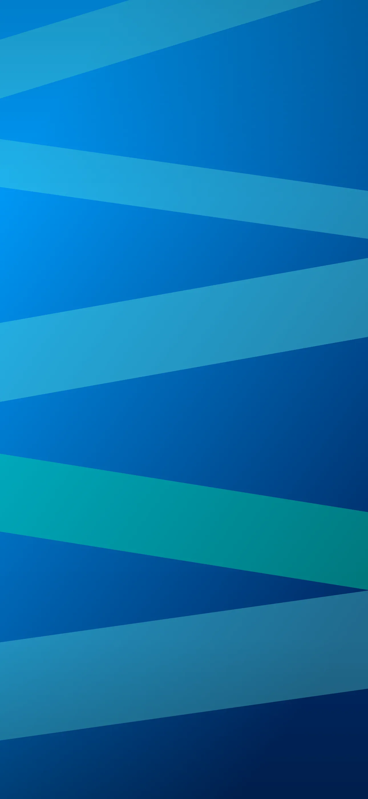
- Linear. Color travels straight down (or across). Top-to-bottom is the classic phone gradient — dark up top, lighter toward the widgets.
- Radial. Color radiates from a point, like a soft glow. Center the glow low and it lifts your home-screen icons off the background.
- Mesh / multi-stop. Several colors bleeding into each other at once — the soft, cloud-like blends you see on modern app screens. The richest and most current look.
- Conic and aurora. Color sweeps around a point or ribbons across the frame like northern lights. More expressive, great as a live wallpaper.
Choosing colors that actually blend
The trap with gradients is banding — visible stripes where two colors meet. It happens when the two ends are too far apart in hue or brightness, or when the file is compressed too hard. Two rules keep blends smooth:
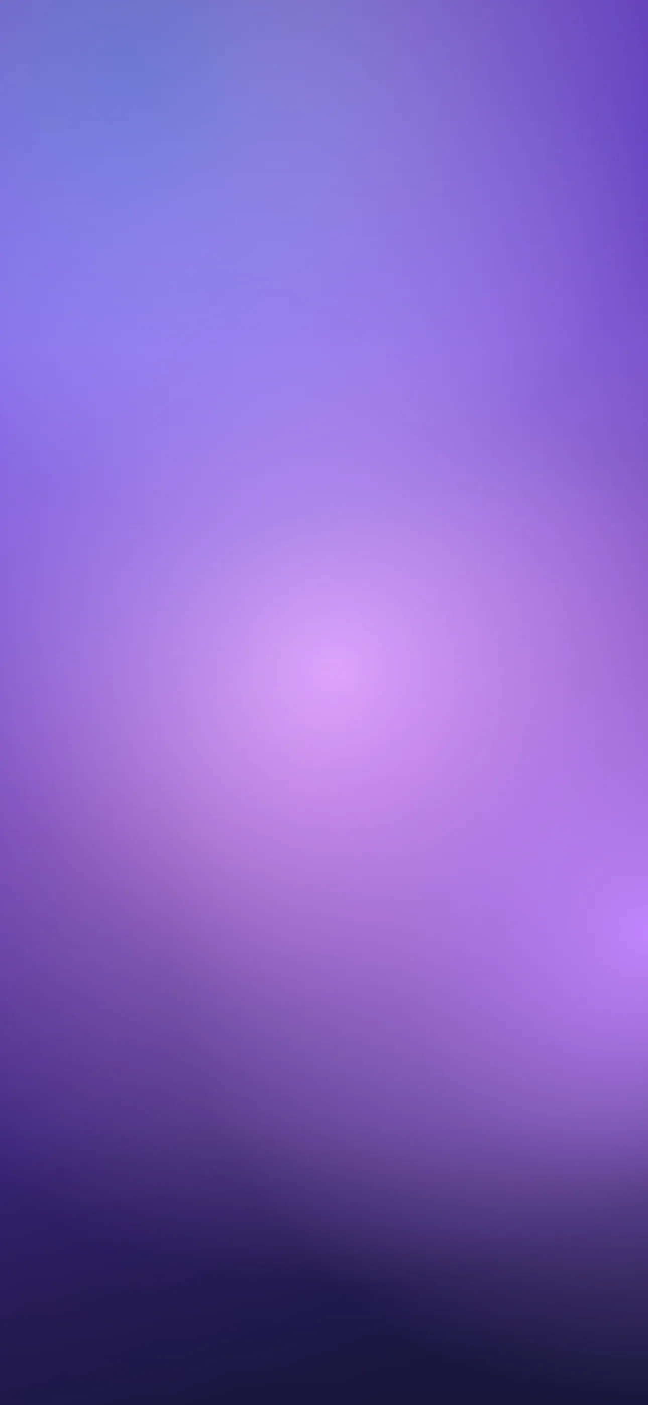
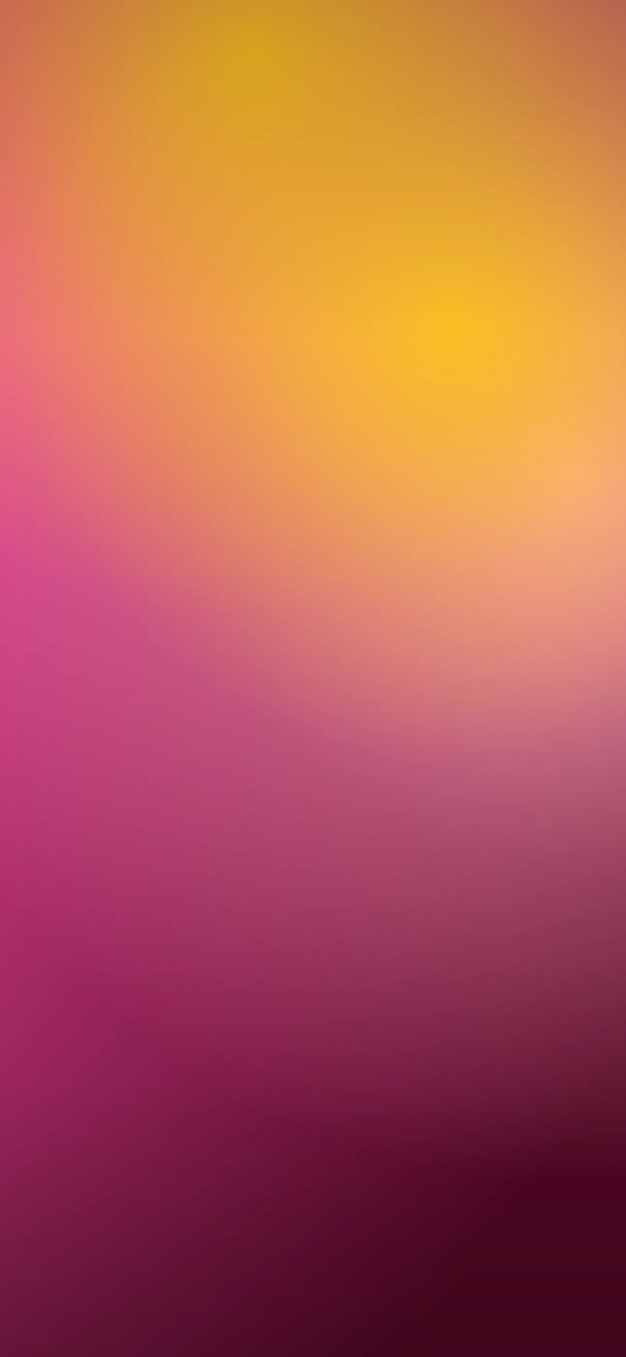
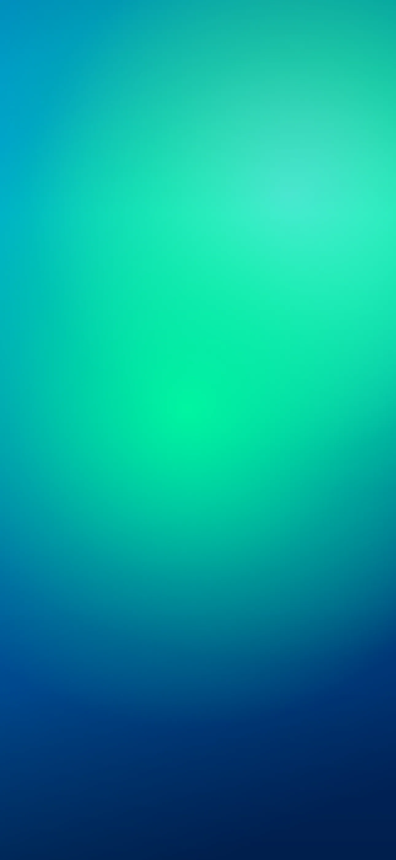
- Keep neighboring hues close. Blue to teal, magenta to orange, indigo to violet — adjacent-ish colors melt together. Blue straight to yellow tends to mud through a gray middle.
- Add a touch of grain or noise. A faint texture hides banding completely and makes the gradient feel deeper, almost atmospheric.
Palettes worth saving: indigo-to-magenta for a dusk feel, teal-to-deep-blue for something cool and calm, peach-to-coral for warmth, and slate-to-black for a moody, minimal screen. If you like restraint generally, gradients sit right next to the minimalist style collection.
Composing for the screen
Set the canvas to your native 1290 x 2796 so the blend stays buttery — gradients are unusually sensitive to upscaling, which introduces the very banding you’re avoiding. Then use the natural top-to-bottom flow to your advantage:
- Darkest at the top. A deep top edge frames the Dynamic Island so the cutout disappears into the screen, and it keeps the clock crisp against a calm field.
- Lighter toward the widgets. Let the lower half ease brighter or more saturated so home-screen icons and the dock have contrast to sit against.
- Watch the clock band. Make sure the mid-frame tone is dark or light enough that the white clock stays legible — a gradient passing through medium-gray right behind the time is the one spot to avoid.
On an OLED iPhone, ending the gradient in true black at the very top gives you a free contrast boost and switches those pixels off entirely.
Making and animating gradients
Gradients are the single best subject for the AI generator, because there’s no anatomy or detail to get wrong — just describe the colors and direction. Try “smooth vertical gradient, deep indigo at top fading to warm magenta, subtle film grain, no banding” or “soft mesh gradient, teal and violet, dark and moody.” Wallpaper Hub’s curated library also sorts gradients by mood and palette, so you can grab one in seconds.
Where gradients really come alive is motion. A live wallpaper gradient that slowly breathes — colors drifting and shifting when you touch and hold the lock screen — is mesmerizing without being distracting, which is hard to pull off with a busy image. And the editor lets you fine-tune: reposition the blend, crop to the exact resolution, and add grain so the result is smooth on your specific display.
A two-minute workflow: pick two adjacent hues, generate or browse a top-dark gradient, add a hint of grain, crop to 1290 x 2796, and set it. Done right, it’s the kind of wallpaper you never get tired of.
Get Wallpaper Hub on the App Store
Gradients reward restraint — pick a palette you love, keep the top dark, and let the color do the work.
Wallpapers from Wallpaper Hub
Full gallery