Best Minimalist Wallpapers for iPhone (4K)
Five 4K minimalist wallpapers for iPhone, from a clean classic look to subtle live motion, AI originals, and deep-black OLED picks around the clock.
Minimalism is the hardest aesthetic to get right on a phone. There’s nowhere to hide: with only a color, a shape, or a sliver of negative space, every decision is visible. But when it lands, a minimalist lock screen does something no busy photo can — it makes the time, your notifications, and your widgets the things you actually see. This guide breaks down what separates a calming minimalist wallpaper from a flat, boring one, and how to build a small set that works for your specific iPhone.
What actually defines minimalist
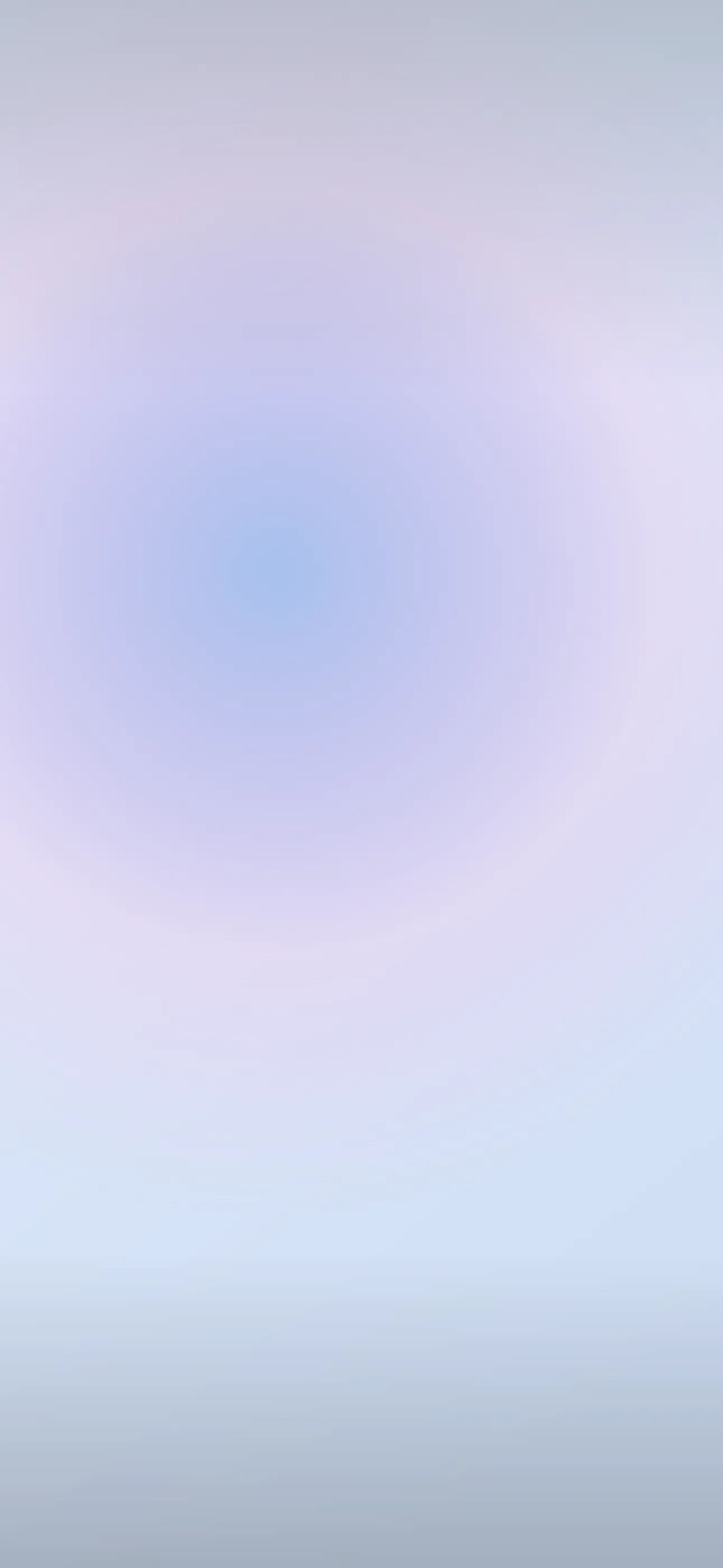
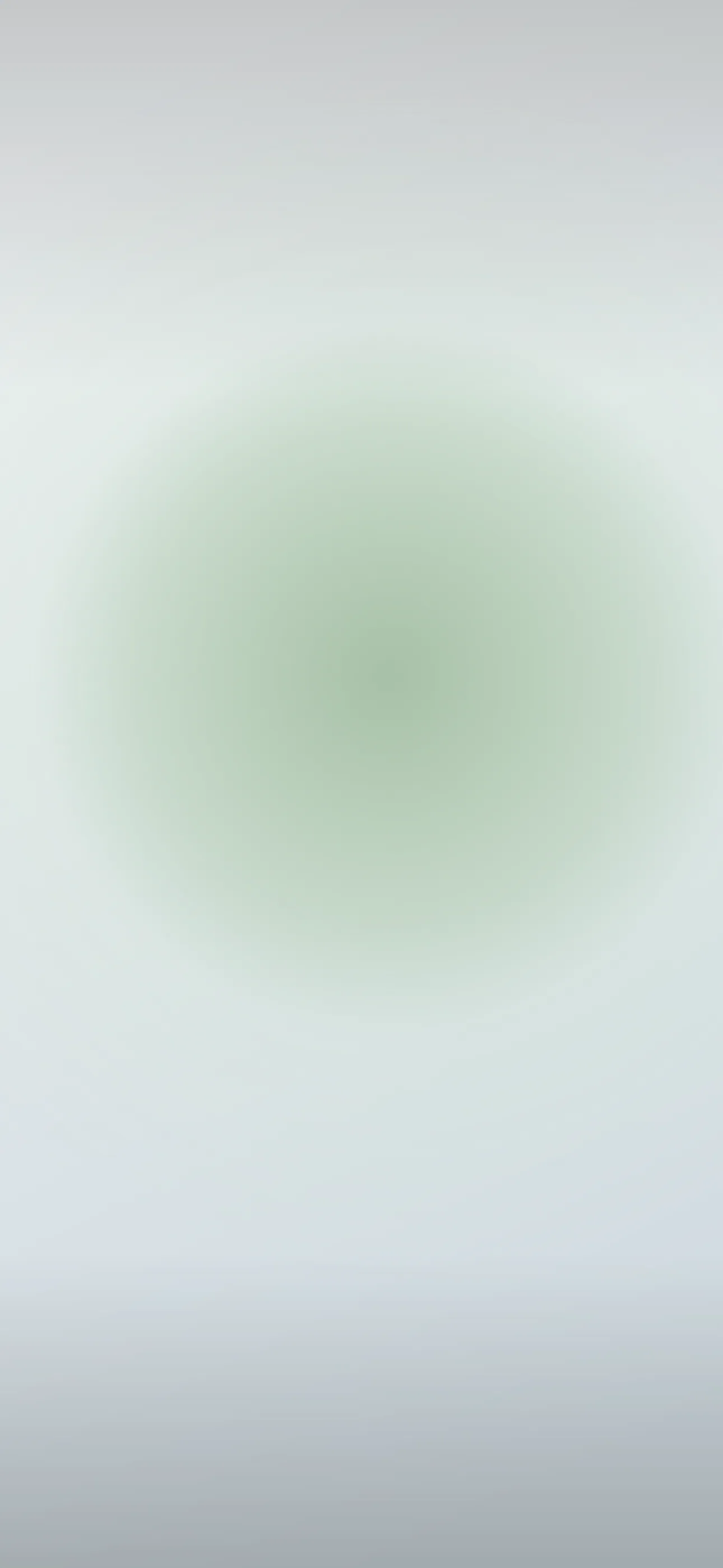
Minimalism isn’t “a plain background.” It’s restraint with intent. The strongest minimalist wallpapers usually rely on one of a few moves:
- Negative space — a single small element placed off-center, with the rest of the frame empty.
- A single gradient — two or three tones blending top to bottom, no hard edges.
- One geometric shape — a circle, an arc, a horizon line, sitting calmly in the frame.
- Texture over imagery — paper grain, soft noise, a matte wash of color that reads as solid from a distance.
The common thread is that nothing competes for attention. If your eye bounces around the screen, it isn’t minimalist — it’s just sparse.
Composing around the clock and Dynamic Island
iOS stacks a lot onto your lock screen: the large clock sits in the upper-middle third, the Dynamic Island cuts into the very top, and your widget row sits just under the time. A minimalist wallpaper lives or dies on how it handles that zone.
The reliable approach is to keep the top third quiet — solid color, soft gradient, or empty space — so the clock has room to breathe and stays legible. Push any subject (a shape, a horizon, a small object) into the lower half where widgets and the flashlight/camera buttons frame it naturally. At 1290x2796 on the latest 6.7” and 6.9” Pro models, that lower band is large enough to anchor a composition without ever crowding the time.
Palettes that age well
Minimalist palettes work best when they’re calm and slightly desaturated. A few that hold up day to day:
- Warm neutrals — bone, sand, clay. Easy on the eyes, friendly with most widget colors.
- Cool greys and slate — quiet and professional, great if your home screen leans monochrome.
- Muted single hue — one soft color (sage, dusty blue, terracotta) carried across the whole frame.
- Off-black — not pure black, but a deep charcoal that feels intentional rather than empty.
Avoid high-saturation neons here. They fight the clock’s auto-color and make widgets harder to read.
True black for OLED, off-white for the rest
Every iPhone 14 Pro and later — plus the iPhone 15/16/17 base models — uses an OLED panel, where pure-black pixels are switched off entirely. A genuinely black minimalist wallpaper looks borderless in a dark room and sips slightly less battery. If you want that effect, look for true #000000 black rather than dark grey. On the dark side of minimalism, a black field with one faint shape is about as clean as a lock screen gets.
On the flip side, a soft off-white or paper-toned wallpaper pairs beautifully with iOS’s tinted and clear widget styles introduced in recent versions.
Where Depth Effect fits (and where it doesn’t)
Depth Effect — where iOS layers the clock behind a foreground subject — needs a clear subject to isolate. Pure gradients and flat color fields won’t trigger it, and that’s fine; they’re not meant to. But a minimalist composition with one defined object (a single leaf, a small sphere, a hand) in the lower frame can layer beautifully, with the object rising in front of the time. If Depth Effect is your goal, choose a wallpaper with one crisp foreground element rather than an all-over texture.
Building your set with Wallpaper Hub
A good minimalist rotation is small — three or four pieces, not thirty. In Wallpaper Hub you can browse a curated minimalist library that’s already cropped for iPhone resolutions, so you skip the upscaling and bad-crop problems that come from saving random images. A few practical ways to use it:
- Pick one neutral daytime wallpaper and one off-black version for night or Focus modes.
- Try a live wallpaper with a slow breathing gradient if you want subtle motion that still reads as minimal — touch and hold the lock screen to see it move.
- If the library doesn’t have your exact tone, the AI generator handles minimalism well. Prompts like “single soft arc, warm sand background, lots of negative space, matte” or “flat sage gradient, no objects” give you a one-of-one in your color.
- Use the editor to recolor or reposition an element so your subject sits cleanly below the clock.
For more on getting the framing right, see How to Set an Aesthetic Wallpaper, and browse other looks under styles if you want to mix minimal with something warmer.
Quick checklist before you set one
- Top third quiet enough for the clock to stay legible
- Palette desaturated, complements your widget colors
- True black if you want the OLED look; off-white for light widgets
- One clear subject if you want Depth Effect, none if you want pure calm
- Native resolution (1290x2796 on current Pro Max) so nothing gets upscaled
Minimalist wallpapers in the app
All minimalist